When it comes to designing a website, every element plays a pivotal role in shaping user experience. Among these elements, the website sidebar UI holds a unique position. A well-designed sidebar can enhance navigation, provide quick access to important content, and contribute to the overall aesthetics of the site. In this article, we will delve into the art of crafting an effective website sidebar UI design that not only complements your site’s layout but also offers a seamless and user-friendly experience.
Website sidebar UI, also known as the user interface of the sidebar, is a vertical column situated either on the left or right side of a webpage. This space is dedicated to showcasing a variety of content, such as navigation links, recent posts, search bars, social media feeds, and more. The purpose of a well-structured sidebar is to provide users with easy access to relevant information and improve overall website navigation.
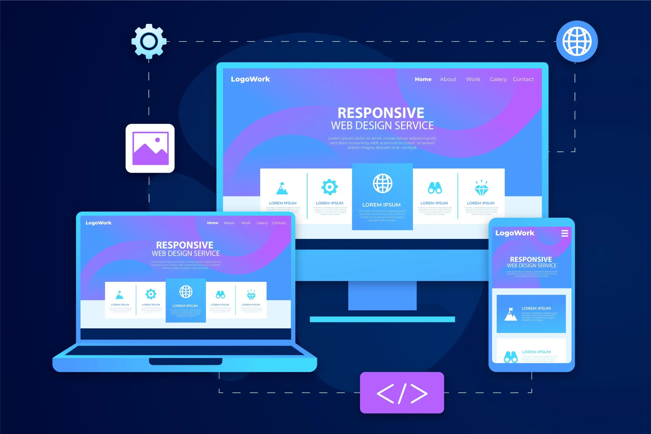
The foundation of a successful website sidebar UI design lies in meticulous planning. Before diving into the design process, it’s crucial to identify the goals and functions of your sidebar. Consider the needs of your target audience and the content you want to showcase. Mapping out the elements you want to include will help you create a cohesive and organized sidebar layout. Additionally, keep in mind that a responsive design is essential to ensure a seamless experience across various devices.
When it comes to website sidebar UI design, simplicity and clarity are key. A clutter-free design enhances user experience and ensures that visitors can quickly find what they’re looking for. Prioritize content hierarchy by placing the most important elements at the top of the sidebar. Icons and images can be used to visually represent different categories or links, enhancing the overall aesthetic appeal. Utilize a consistent color scheme and typography that aligns with your website’s branding for better readability.
An effective sidebar UI design revolves around user needs. Display relevant information and links that cater to your audience’s interests. Incorporate navigation menus and categories that make it easy for users to explore different sections of your website. Showcase recent or popular posts to keep visitors engaged and encourage them to explore your content further. Introduce strategically placed calls to action (CTAs) to guide users toward desired actions, such as signing up for newsletters or exploring special offers.
Adding interactive elements to your sidebar UI can enhance user engagement. Implement a search bar that allows users to quickly find specific content. Integrate social media links and feeds to encourage visitors to connect with your brand on different platforms. Include subscription options, such as newsletters or RSS feeds, to keep users informed about updates. Interactive widgets like calendars and weather updates can add utility to your sidebar and enhance the user experience. If you’re interested in learning more about creating an effective sidebar for your website, you can explore resources on learning website sidebar design.

Website sidebar UI placement and visibility are critical aspects of design. Studies have shown that users often follow an “F” pattern when scanning content on a webpage, with their gaze moving horizontally across the top and then vertically down the left side. Placing essential elements within these areas can increase their visibility. Additionally, ensure that your sidebar design is responsive and mobile-friendly, as a significant portion of users access websites through mobile devices.
Understanding the impact of user-friendly websites on enhancing user experience is essential. To delve deeper into this topic, you can explore more about it in the influence of user-friendly websites. This link will provide valuable insights into how user-friendly design principles, including effective sidebar UI, can positively shape user engagement and satisfaction.

Monitoring the performance of your sidebar UI is essential for continuous improvement. Keep an eye on engagement metrics such as click-through rates and the time users spend interacting with sidebar elements. Heatmaps and user behavior analysis tools can provide insights into how visitors interact with your sidebar. Based on these insights, make data-driven adjustments to optimize the sidebar’s performance and enhance the user experience.
While a well-designed sidebar can greatly enhance user experience, there are common mistakes that should be avoided. Overloading the sidebar with excessive content can overwhelm users and lead to a cluttered design. Confusing layout and navigation can frustrate visitors and deter them from exploring further. Neglecting mobile users’ experience can result in a poor user experience for a significant portion of your audience. Lastly, poorly executed color and contrast choices can affect readability and overall aesthetics.
In the realm of web design, the website sidebar UI holds the potential to significantly impact user experience. By implementing thoughtful planning, adhering to design principles, and focusing on user needs, you can create an effective sidebar that enhances navigation and engagement. As you embark on your design journey, remember that an optimized sidebar UI not only contributes to the overall aesthetics of your website but also plays a crucial role in delivering a seamless and enjoyable browsing experience for your visitors.
As you explore website sidebar UI design, consider partnering with experienced designers and developers who specialize in crafting intuitive and user-friendly interfaces. A well-executed sidebar can become a powerful tool in your website’s arsenal, providing users with easy access to valuable content and enhancing their overall interaction with your site.
In the realm of modern web development, understanding and implementing effective web development strategies is crucial. The field has evolved significantly, placing user experience and functionality at the forefront. From crafting visually appealing interfaces to ensuring seamless functionality, these strategies play a pivotal role in creating exceptional online experiences.
Modern web development strategies encompass more than aesthetics and functionality. They now encompass a holistic user experience, where responsiveness and accessibility across devices are paramount. This shift in user expectations has brought mobile optimization and responsive design to the forefront as core strategies. As part of the design strategy, developers collaborate with designers to create engaging experiences that translate seamlessly across various devices. To gain more knowledge about web development best practices, you can refer to our comprehensive guide.
Front-end development is the face of your web application. The use of HTML5, CSS3, and JavaScript ES6+ forms the foundation for creating dynamic and engaging interfaces. Modern front-end frameworks like React, Vue, and Angular provide developers with powerful tools to build interactive user interfaces efficiently. Embracing a mobile-first approach ensures that your web application is designed with responsiveness in mind from the outset.
While the front end captures user attention, the back end powers the functionality behind the scenes. Choosing the right server-side programming language, such as Node.js, Python, or Ruby, is crucial for backend developers. Developing RESTful APIs enables seamless data communication between front-end and back-end components. Effective database management and optimization techniques contribute to the overall performance of the web application, ensuring a smooth user experience.
The demand for full-stack developers who can handle both front-end and back-end development has grown significantly. Full-stack developers possess the skills to integrate these components seamlessly, creating a cohesive user experience. They understand the intricacies of both ends and can bridge the gap between design and functionality effectively. This approach streamlines the development process and ensures consistency throughout the application.

In the realm of modern web development, speed is paramount. Websites must load quickly to retain user engagement and avoid high bounce rates, which can impact search engine rankings. Employing techniques to optimize website performance, such as minimizing file sizes, leveraging caching mechanisms, and utilizing content delivery networks (CDNs), can significantly enhance user experience and search engine optimization. Additionally, focusing on intuitive navigation and user-friendly design contributes to a positive user journey and enhanced experience.
As technology continues to advance, advanced strategies are gaining prominence. Front-end web development is no longer limited to static websites; the demand for dynamic websites has led to the incorporation of more complex functionalities. Progressive Web Apps (PWAs) combine the best of web and mobile applications, offering enhanced user experiences. Serverless architecture provides scalability without the hassle of managing servers. APIs and microservices enable modular development, allowing for flexible and efficient application scaling. Incorporating artificial intelligence and machine learning adds a layer of intelligence to web applications, creating an engaging experience for users.
Testing is a cornerstone of effective web development. From unit testing to user acceptance testing, these processes ensure the application’s functionality and reliability. Debugging tools aid in identifying and resolving issues swiftly. Embracing continuous integration and continuous deployment (CI/CD) pipelines streamlines development and deployment processes, leading to more efficient workflows. Quality Assurance (QA) teams play a critical role in ensuring that the final product meets high standards.
Web development is a dynamic field, constantly evolving to meet new challenges and opportunities. Staying current is essential to remain competitive. Continuous learning and skill development are vital components of a successful web developer’s journey. As emerging technologies like augmented reality, virtual reality, and voice interfaces gain traction, web developers must adapt to these trends to deliver innovative and cutting-edge experiences. Incorporating search engine optimization techniques ensures that your website ranks well on search engines and stands out among competitor websites.
Mastering modern web development strategies is a journey of continuous learning and adaptation. From understanding the evolving landscape to implementing advanced techniques, each step contributes to the creation of exceptional online experiences. By focusing on user-centric design, optimizing performance, and staying informed about emerging trends, web developers can create web applications that stand out in today’s competitive digital landscape. As the future unfolds, those who embrace these strategies will be well-equipped to shape the digital experiences of tomorrow, employing effective content strategy, delivering high-quality content, and aligning with overarching business strategies. As the web development industry evolves, the pursuit of creating high-quality websites with engaging experiences remains at the forefront of success.
In an era dominated by digital experiences, the significance of user-friendly websites cannot be overstated. These platforms serve as the gateway to information, services, and interactions. Designing websites with users at the forefront is more than a trend; it’s a necessity. The concept of user-friendly websites revolves around creating a seamless and enjoyable online experience, where users can effortlessly navigate, engage, and achieve their goals. This article delves into the principles of user-centered web design, highlighting the importance of minimizing frustration and enhancing user satisfaction. From stunning design to a responsive layout, and everything in between, user-friendly websites are key to a positive online presence.
User-centered design is the bedrock of creating user-friendly websites. At its core, this approach revolves around empathizing with users, understanding their needs, and crafting digital experiences that align with their expectations. It’s a delicate balance between user needs and business objectives, ensuring that the website serves both parties effectively. By adopting this mindset, designers can create interfaces that are not only visually stunning but also functional and user-friendly.
User research serves as the cornerstone of user-centered design. Conducting interviews, surveys, and analyzing user behaviors provide insights into their preferences, pain points, and expectations. Building user personas helps designers visualize their target audience and tailor the website’s creative design and content to suit their needs. By actively involving users in the design project, designers can mitigate frustration by addressing user concerns directly.
One of the key elements of user-friendly websites is streamlined navigation. Users should be able to find what they’re looking for without unnecessary clicks or confusion. Clear labels, intuitive menus, and a user-friendly layout contribute to a frustration-free experience. By implementing a well-defined information architecture, designers ensure that users can quickly locate relevant information, reducing the likelihood of frustration.
User-friendliness extends to various devices and user abilities. A responsive layout ensures that websites function seamlessly on desktops, tablets, and smartphones, catering to the diverse ways users access content. Moreover, accessibility is a fundamental aspect of user-centered design. Websites should be usable by individuals with disabilities, ensuring that everyone can navigate and interact with the content without frustration.
To delve deeper into the world of responsive web design, you can explore our comprehensive guide: Mastering the Art of Responsive Web Design. This resource offers practical techniques, examples, and insights to help you create fluid and adaptable designs that provide an optimal experience across all devices.
Visual design goes hand in hand with user-friendly websites. Consistent branding elements, such as logos and color schemes, provide a cohesive identity that resonates with users and enhances the online presence. Thoughtful use of color, typography, imagery, and white space enhances readability and engagement, making the website more inviting and user-friendly.
Page load times significantly impact user satisfaction and search engine rankings. Slow-loading websites lead to frustration and high bounce rates. Designers need to optimize images to ensure a fast loading time without compromising high-quality images. Balancing aesthetics with performance considerations is crucial for delivering a stunning design with a seamless experience that doesn’t frustrate users.

User-friendly websites prioritize content that addresses user needs. Clear and concise language helps users understand the information presented. The content should be organized logically, with headings, subheadings, and bullet points aiding readability. Incorporating multimedia elements, such as images and videos, enhances engagement, making the content more appealing and user-friendly. To facilitate efficient content management, a robust content management system (CMS) can be employed. A CMS streamlines the process of creating, editing, and organizing content, ensuring that the website’s information remains up-to-date and relevant to users.
The journey to a user-friendly website is an iterative process. Usability testing involves real users interacting with the website to identify pain points and areas of frustration. Feedback from these tests guides designers in making necessary refinements. By continuously iterating the design based on user insights, frustration is minimized, and the website evolves into a more user-friendly platform that resonates positively with potential customers.
For a more in-depth understanding of how to apply these website design principles to your projects, you can explore my detailed guide: Step-by-Step: Applying Website Design Principles to Projects. This comprehensive resource takes you through practical steps, examples, and insights to help you create user-friendly websites that truly resonate with your audience.

Numerous tools and resources are available to aid designers in creating user-friendly websites. From wireframing and prototyping tools to analytics platforms, these resources provide valuable insights into user behavior and preferences. Staying updated on design trends through online resources and enrolling in UX design courses equips designers with the knowledge and skills needed to craft exceptional user experiences that contribute to a positive online presence.
User-centered design is not just a process; it’s a philosophy. It requires a mindset shift that places users at the heart of design decisions. Collaboration with stakeholders, including users, ensures that the final product caters to their needs. As the design landscape evolves, embracing a user-centered approach becomes essential for staying relevant and delivering user-friendly websites that stand the test of time and contribute positively to search engines.
Creating user-friendly websites is an ongoing journey that demands dedication, empathy, and a commitment to minimizing frustration. By understanding user needs, streamlining navigation, optimizing performance, and embracing user-centered design principles, designers can transform websites into platforms that users not only appreciate but also enjoy using. As the digital landscape continues to evolve, prioritizing user satisfaction through user-friendly design remains a non-negotiable aspect of successful web design. With a blend of stunning design, a responsive layout, and a user-friendly approach, websites can leave a lasting impression, resonate positively with visitors, and contribute to a strong online presence.
In today’s interconnected digital landscape, the concept of security has taken center stage. As Internet users increasingly rely on the web for various activities, ensuring secure websites has become paramount. Users want to trust that the address bar displaying secure versions of websites reflects a high level of security. The rise in cyber threats, from malicious sites to man-in-the-middle attacks, underscores the need for secure websites that protect user data and interactions. This article delves into the evolution of web security trends, explores rising trends in secure web development, examines the role of SSL certificates, suggests strategies to mitigate cyber threats, emphasizes user privacy and compliance, envisions the future landscape of secure web development, and provides practical steps for building a secure web presence.
The history of the internet is marked by vulnerabilities exploited by malicious actors. However, HTTPS and Secure Sockets Layer (SSL)/Transport Layer Security (TLS) protocols have changed the game. These innovations introduced encryption to data transmission, shielding it from prying eyes and ensuring the confidentiality and integrity of user interactions on the web. Web security is now expected to be the norm, as Internet users seek assurance through the address bar displaying secure versions.

Secured websites are evolving, bolstered by trends that prioritize user safety and experience. HTTPS, once a preference, is now a standard, bringing SEO benefits and user trust. For instance, consider the case of a financial institution that saw a 20% increase in user engagement after implementing HTTPS across its platform. Two-factor authentication (2FA) adds an extra layer of security to user accounts, reducing the risk of unauthorized access.
Content Security Policy (CSP) prevents cross-site scripting attacks, as demonstrated by a popular social media site that successfully reduced malicious script injection by 90% with CSP implementation. Progressive Web Apps (PWAs) merge seamless browsing with secure interactions, creating a fast and reliable user experience. WebAssembly ensures performance without compromising security, as evidenced by the faster load times achieved by a gaming website without compromising on security measures. Secure websites are no longer just sites; they are Secure sites, ensuring both trust and performance.
SSL certificates are at the core of secure websites, authenticating website identities and encrypting data transmission between browsers and servers. This not only ensures privacy but also enhances credibility and ranking. Consider the impact of a business that saw a 15% increase in online transactions. After implementing extended validation SSL certificates, leading to improved customer trust. The installation and management of SSL certificates, which range from single-domain to multi-domain SSL certificates, require careful consideration. The process transforms a website into a legal entity, providing security services to Internet users. For those seeking deeper insights into crafting secured websites, a comprehensive guide offers step-by-step guidance on constructing secure online platforms, complete with case studies of successful SSL implementation.
Malicious sites and man-in-the-middle attacks are persistent threats, targeting Internet users who access websites through the address bar. Developers implement measures to prevent cross-site scripting (XSS) attacks, such as input validation. For instance, a major e-commerce site reduced its vulnerability to XSS attacks by 70% through rigorous input validation protocols. SQL injection vulnerabilities are thwarted through proper parameterized queries. As demonstrated by a government portal that eliminated data breaches through meticulous query validation.
Cross-site request forgery (CSRF) protection ensures attackers cannot trick users into unauthorized actions, exemplified by a social networking platform that successfully prevented unauthorized posts through CSRF safeguards. Timely updates and security audits are essential for combating evolving cyber threats, as seen in the case of a technology blog. That maintained its security integrity through regular audits and updates. To enhance your understanding of building a secure web presence, familiarize yourself with web development best practices, drawing inspiration from real-world examples of successful threat mitigation.

In an era of data breaches and privacy concerns, secure websites prioritize user privacy and compliance. Regulations like GDPR underscore securing user data and obtaining consent. Transparent user tracking policies, cookie consent mechanisms, and privacy-focused design ensure compliance. A notable example is that of a health and fitness site that witnessed a 40% increase in user sign-ups after implementing user-friendly GDPR-compliant data handling processes. Secure websites guide users through strong passwords and encourage users to secure their email addresses. As demonstrated by an online education platform that successfully educated its users about password hygiene.
As technology advances, securing websites is an ongoing challenge. Machine learning and AI aid in threat detection, adapting security measures in real-time. A prime example is a cybersecurity firm that achieved a 60% reduction in false positives by implementing AI-powered threat detection. Blockchain technology transforms how user data is managed, reducing vulnerabilities.
Consider the case of an e-commerce marketplace that enhanced its security by implementing blockchain-based identity verification, resulting in a 50% decrease in fraudulent activities. Quantum computing’s potential impact on encryption poses new challenges, necessitating ongoing research by cybersecurity companies. Stay informed about quantum-resistant encryption methods developed by cutting-edge companies, ensuring your website’s security remains future-proof.
Secured websites require a collaborative effort. Developers, designers, and cybersecurity experts collaborate to implement secure coding practices. As Federal websites experience massive attacks, securing the Internet is a collective responsibility. Users play a role by adopting web security basics, such as strong passwords, encryption algorithms, and anti-malware software. To fully grasp how to create a safe website, understand the crucial role of web hosting. Learn more about the important role of web hosting in building secure websites, and make informed decisions about the technical aspects of your secure website.
Navigating the secure web is essential in today’s digital landscape. Secure websites, fortified by SSL certificates, address bar indicators, and strong web security measures, empower Internet users. From securing email addresses to mitigating man-in-the-middle attacks, securing websites is fundamental. By prioritizing security, complying with regulations, adopting security tips, and learning from real-world examples. We can collectively build a more secure Internet where users trust the address bar to lead them to secure, protected, and user-friendly websites. Your journey towards web security starts with these insights, equipping you to create a digital presence that is both innovative and safe.
In the rapidly evolving realm of digital solutions, businesses are leveraging advanced technologies to enhance their online presence and effectively connect with their audience. One of the pivotal drivers of this technological revolution is the Flutter app development service. This dynamic platform amalgamates the finesse of artistic creativity with the precision of technical expertise, enabling businesses to conceive and materialize captivating mobile applications across various platforms. As a distinguished flutter app development company, we understand the essence of this fusion – an intricate dance between design sensibilities and technical proficiencies. Our expertise lies in crafting exceptional user experiences through the synergy of the Flutter framework and our talented pool of dedicated flutter app developers.
At its core, Flutter app development service epitomizes the harmonious convergence of design and technology. Developed and championed by Google, this innovative framework serves as a bridge between imaginative design concepts and their functional execution. Businesses that embrace Flutter gain the advantage of constructing applications from a singular codebase, streamlining the development time and effort significantly. This approach not only facilitates the creation of visually appealing interfaces but also ensures the integration of robust functionalities that meet diverse business requirements. This duality inherent in Flutter’s nature highlights its capacity to metamorphose abstract ideas into tangible, refined products where each pixel and interaction is meticulously sculpted.
The nucleus of any triumphant application resides in a design that revolves around the user’s experience. This is where Flutter truly distinguishes itself, not just as a framework but as a catalyst for achieving business goals. The Flutter app development service empowers businesses to create interfaces that are not only artistically engaging but also intuitively navigable. The extensive widget library of Flutter acts as a toolkit for designers, allowing them to craft interfaces that seamlessly blend aesthetics with user-friendliness. The foundation of Flutter’s design principle is rooted in reactive programming, ensuring that the interface promptly responds to user actions, thereby enhancing usability and engagement. This is especially crucial in the realm of mobile app development services, where user satisfaction is paramount.
Gone are the days when maintaining separate codebases for different platforms was a cumbersome necessity. Flutter eliminates this challenge by offering a unified codebase approach, enabling developers to craft applications simultaneously for iOS, Android, web, and even desktop platforms. This not only streamlines the development process but also guarantees consistency across various platforms, regardless of the business requirements. Flutter’s adaptive design philosophy automatically tailors the application’s layout and components to suit diverse screen sizes, providing a coherent experience regardless of the device being utilized. This efficient cross-platform app development capability saves both time and resources, contributing to faster project delivery.

Performance is a pinnacle consideration in app development, and Flutter truly excels in this domain. Leveraging the power of the Skia graphics engine, Flutter ensures smooth animations and a high-performance user interface that rivals native performance. Moreover, Flutter apps are compiled to native ARM code, bypassing the need for a bridge and reducing execution time. This translates to agile app experiences characterized by swift loading times and rapid responsiveness to user interactions. Such optimization is a cornerstone of our flutter development services, ensuring that the applications we craft meet not just artistic standards but also the expectations for native-like performance.
The Flutter community stands as a vibrant testament to innovation and collaboration. With a fervent and dedicated community of Flutter developers, the framework evolves perpetually with new packages, plugins, and tools. This open-source nature fosters an environment of creativity, enabling developers to seamlessly integrate cutting-edge features and functionalities into their applications, aligning with the diverse business goals. This collaborative approach resonates with our philosophy as a flutter app development company, where we believe in harnessing the collective knowledge and expertise of the community to deliver exceptional solutions to our clients.
Quality assurance is paramount in the realm of application development. Flutter’s inherent structure promotes unit testing, allowing developers to validate each component’s functionality in isolation. This ensures that the application is robust and resilient to errors, contributing to a smooth user experience. Additionally, Flutter’s open-source nature encourages source contributions from the community, fostering an environment of shared progress and innovation. As a dedicated development agency, we leverage these advantages to deliver excellent solutions that stand up to rigorous testing.
A seamless project management process is the cornerstone of timely and successful application development. Our efficient project managers are not just experts in Flutter but also skilled navigators, ensuring that your project’s journey is smooth and well-organized. From the ideation phase to the final launch, our dedicated project managers keep a keen eye on the project’s progress, aligning it with your business requirements and goals. Their expertise ensures that your project is on track for faster time-to-market, while still adhering to the highest standards of quality.

At times, your business requirements may demand an extended team to bring your innovative ideas to life. Our incredible team of Flutter developers functions as an extended team for your organization. This collaborative approach ensures that your unique vision is realized with precision and creativity. With Flutter’s flexibility, our dedicated team seamlessly integrates into your existing processes, providing the technical expertise required to transform your innovative ideas into fully functional applications.
The Flutter framework opens doors to a wide range of possibilities when it comes to advanced functionality. Whether you require complex animations, intricate interactions, or sophisticated features, Flutter empowers our team of Flutter programmers to bring your ideas to fruition. The framework’s versatility enables us to align our solutions with your business goals, creating applications that not only meet but exceed your expectations.

Embracing Flutter for app development offers a myriad of benefits, catering to various aspects of the development team and the final app performance. With its unique capacity for cross-platform app development, Flutter simplifies the process of targeting multiple operating systems. This means that businesses can reach a wider audience without investing in separate development efforts for each platform. Furthermore, the optimized performance of Flutter apps, akin to native performance, ensures a seamless user experience across devices and operating systems.
The Flutter framework also fosters collaboration and efficient project management. The thriving community of Flutter developers actively contributes to the framework’s growth, resulting in constant updates, new tools, and improved functionalities. This collaborative approach aids in source contributions and offers developers a supportive environment to tackle challenges collectively.
Moreover, Flutter’s flexibility enables our team to swiftly adapt to changing business requirements, ensuring that your app remains aligned with your evolving goals. This agility is crucial in a rapidly changing digital landscape.
Incorporating Flutter into your mobile app development strategy not only empowers you with advanced functionalities but also accelerates development time and enhances the quality of your applications. The benefits extend beyond your immediate projects, as the efficiency of Flutter can lead to faster time-to-market, enabling you to respond swiftly to market demands and stay ahead of the competition.
In the dynamic landscape of app development, innovation is the driving force. Our dedicated team of Flutter developers is committed to transforming your app idea into reality. As a proficient flutter app development company, we understand that each project is unique and demands tailored solutions. With a blend of artistic flair, technical expertise, and efficient project management, we stand as your trusted partner in realizing your digital ambitions.
In conclusion, Flutter app development service forms a bridge between artistry and science, resulting in applications that enrapture users and propel business success. The framework’s distinctive capacity to amalgamate design aesthetics with technical precision creates a stage for unparalleled user experiences. Should you be poised to embark on a journey that melds creativity with technology, our Flutter app development service is primed to guide you through each stride. Together, let’s engender applications that stand as true testaments to the contemporary digital era’s magnificence.
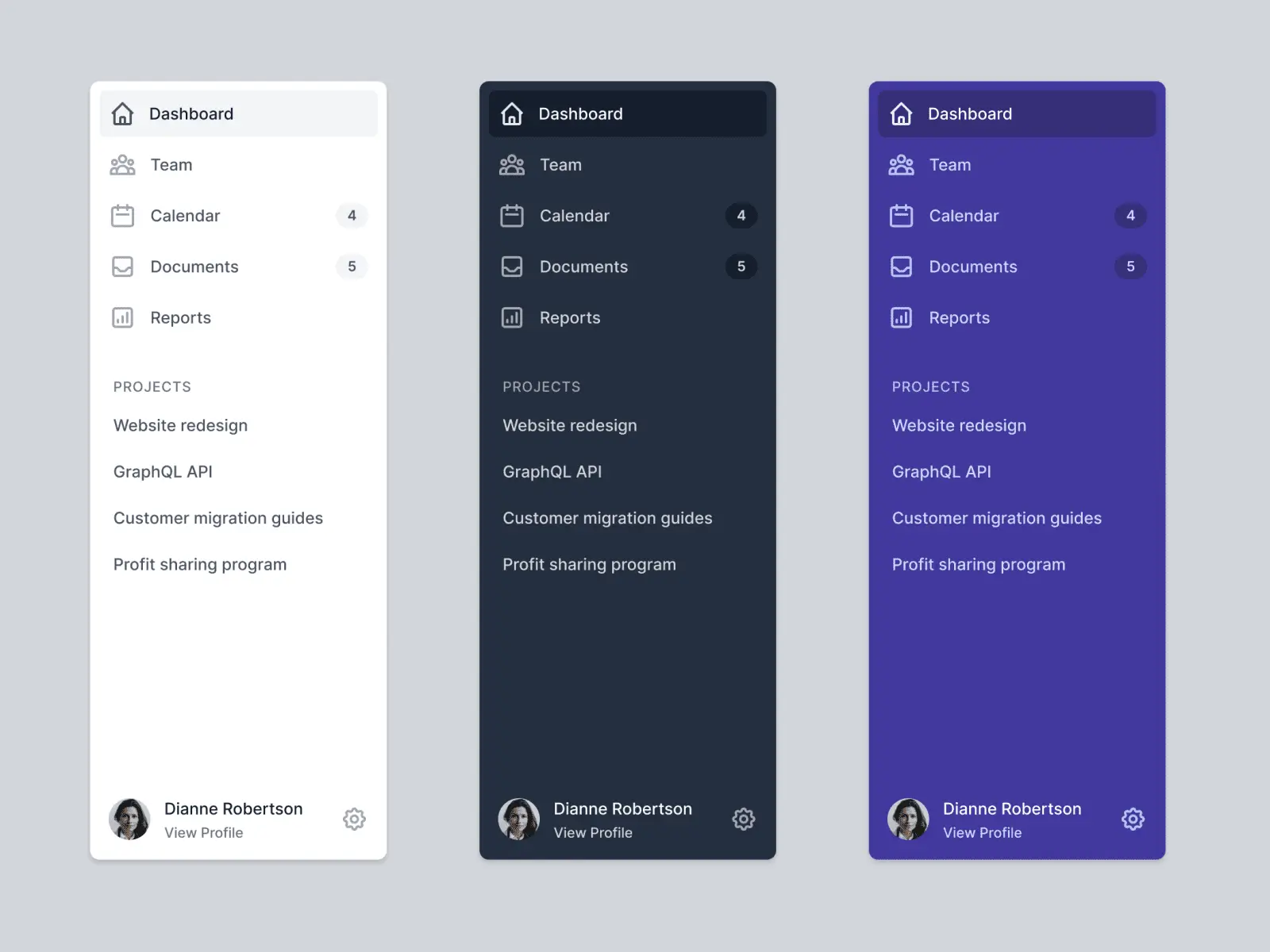
Website sidebar design is paramount for optimizing user experience and enhancing functionality. As visitors navigate your website, the sidebar—central to website sidebar UI design—stands as a prime space for swift access to essential information, navigation items, and engagement. When crafted with utmost care, a website sidebar evolves into an invaluable tool for promoting your brand and catering to the specific needs of your target audience. In this comprehensive guide, we’ll delve into the art of creating a website sidebar that aligns seamlessly with your brand identity while catering to the preferences of your audience.
Your website serves as a virtual extension of your brand. Before delving into sidebar design, take a deep dive into your brand’s identity. Define your brand’s visual elements, such as colors, typography, and icons. Consider the tone and personality you want your brand to convey. These elements will serve as the foundation for your sidebar’s aesthetics, ensuring a cohesive and consistent user experience that resonates with your brand.
To create a website sidebar that truly resonates with users, it’s essential to understand your target audience. Define their demographics, preferences, and behaviors. Are they tech-savvy millennials, busy professionals, or senior citizens seeking information? Tailor your sidebar elements to address their needs and preferences. This might involve featuring quick links to the most relevant content, such as blog categories, product pages, or resources.

Cluttered sidebars can overwhelm users, while sparse ones may fail to provide value. Clearly outline the purpose of your website sidebar. Is it for navigation, showcasing recent content, promoting special offers, or encouraging social media engagement? Prioritize essential content and features that align with your audience’s expectations and your brand’s objectives. This might include user interfaces like search functionality, recent posts, newsletter sign-up forms, or product recommendations.
Website layouts can vary significantly, influencing how your sidebar is presented. Whether it’s a fixed sidebar, floating sidebar, or collapsible one, ensure that the layout maintains a harmonious balance with other design elements. Pay special attention to responsive design, as the sidebar’s appearance may differ on desktop and mobile devices. Consistency across devices is essential for providing a seamless user experience.
The components within your sidebar play a crucial role in functionality and engagement. Incorporate widgets that serve your audience’s needs and align with your brand’s goals. Navigation menus, drop-down menus, search bars, categories, tags, and social media links are common elements that enhance user experience. Each widget should contribute meaningfully to the overall usability of your website, making navigation intuitive and content discovery efficient.
Additionally, consider incorporating elements that educate your users about modern web design principles. Learn more to explore “Modern Web Design Principles” to discover how the latest design trends can elevate your website’s aesthetics and user experience.
A visually consistent website sidebar contributes to the overall aesthetics and professionalism of your website. Ensure that your chosen colors, fonts, and design elements align with your brand’s identity. A harmonious design not only enhances the user experience but also communicates the trustworthiness and authenticity of your brand. Consistency in design fosters a sense of familiarity for users as they navigate your site.
Efficient sidebar navigation is a hallmark of a well-designed website. Utilize vertical navigation bars or sidebar menus to organize content logically. Incorporate dropdown menus for subcategories, creating a hierarchical structure that guides users effortlessly through your site’s offerings. A well-structured sidebar navigation system enhances user experience and ensures easy access to various sections of your website.
Consider offering a black mode design option for your website sidebar. Dark mode not only caters to user preferences but also adds a touch of sophistication. Implement design brilliance by utilizing canvas design techniques, parallax effects, and interactive elements within your sidebar. Striking a balance between aesthetics and functionality contributes to an immersive user experience.
Leverage the power of CSS to achieve a comprehensive design for your website sidebar. Apply design principles such as contrast, alignment, proximity, and consistency to create a visually appealing and user-friendly sidebar. Pay attention to typography, spacing, and visual hierarchy to guide users’ attention effectively and enhance readability.
Once your sidebar design is in place, it’s time to put it to the test. Conduct user testing to gauge its usability and effectiveness. Gather feedback from actual users and make iterative improvements based on their insights. User feedback can shed light on whether your sidebar design meets their expectations, is easy to navigate, and contributes to a positive overall experience.
Examining real-world examples can provide valuable insights into effective website sidebar UI design. Showcase websites that have successfully aligned their brand identity with audience preferences through well-designed sidebars. Highlight how these designs contribute to user engagement, efficient navigation, and the overall enhancement of the website experience.
Implementing your custom sidebar design involves collaboration with designers or using design tools to bring your vision to life. Ensure that the design integrates seamlessly with your website’s existing layout and functionality. Test the sidebar across various devices and browsers to guarantee a consistent experience for all users.
A well-designed website sidebar is not a static element. Regularly monitor its performance using analytics tools. Track user interactions, click-through rates, and engagement metrics related to the sidebar components. Make data-driven adaptations based on user behavior to continuously enhance the sidebar’s effectiveness and user experience.
A carefully designed website sidebar is a powerful asset that can significantly impact user engagement and satisfaction. By aligning your brand identity with the preferences of your target audience, you create a valuable space that promotes easy navigation, quick access to information, and enhanced engagement. Remember that effective website sidebar UI design is an ongoing process that requires monitoring, adaptation, and a commitment to delivering a seamless user experience that reflects your brand’s essence.
In today’s digital era, having a website is essential for individuals and businesses alike. However, with the increasing number of cyber threats and attacks, it is crucial to ensure that your website is secure and resilient. Creating a secure website is an art that requires a combination of technical skills, knowledge, and best practices. In this article, we will explore the art of creating secure websites and provide you with tips and strategies to protect your online presence from cyber threats. Whether you are building a website from scratch or looking to enhance the security of your existing website, this article will guide you through the essential steps to keep your website safe and secure. This article delves into the strategies and best practices that web developers must embrace to ensure the creation of secure and resilient online platforms that align with the national security interests of nations.
At the heart of any secure website, including official websites of senior leaders and organizations like the U.S. Department of Defense, lies a foundation of robust security measures. Developers must comprehend and address the vulnerabilities that threaten to undermine secured websites. Attacks such as SQL injection and cross-site scripting exploit weaknesses in the code, emphasizing the need for meticulous input validation and output encoding. Encryption, a pillar of data protection, ensures that sensitive information remains unreadable even if intercepted. Furthermore, implementing strong authentication and authorization mechanisms prevents unauthorized access and ensures that users interact with the website within defined parameters.
Creating secured websites involves more than just coding practices; it requires a well-thought-out architecture. Secure architecture begins with adhering to the principle of least privilege. By granting users and processes only the necessary permissions, the attack surface is significantly reduced. Moreover, segregating front-end and back-end security measures minimizes potential vulnerabilities. This approach is particularly crucial for official websites of organizations like the U.S. Department of Defense, where the safe space for information dissemination is critical. A robust architecture lays the groundwork for a resilient website that can withstand various cyber threats.
While establishing a secure architecture is paramount, it’s also important to choose the right Content Management System (CMS) that aligns with your security and functionality requirements. In fact, selecting the appropriate CMS is a foundational step in building a secure and effective online platform. To delve deeper into this topic, consider reading the blog post Choosing the Right CMS for Your Website.
Resilience in the face of ever-evolving threats requires proactive measures. Developers must adopt a range of best practices to thwart potential attacks. Beyond input validation and output encoding, techniques like countering cross-site request forgery (CSRF) are essential. Websites can enforce CSRF tokens to verify the authenticity of requests, ensuring that actions are genuine. The implementation of a Content Security Policy (CSP) adds another layer of security, allowing developers to define where resources can be loaded from, mitigating the risk of code injection attacks.
Securing sensitive data is a cornerstone of website security. Encryption plays a pivotal role in this aspect, safeguarding data both during transmission and while at rest on servers. Properly storing and transmitting user authentication credentials is critical, often necessitating the use of encryption and secure protocols. Additionally, developers must establish stringent access controls to prevent unauthorized users or processes from accessing confidential information.
Robust security extends beyond the confines of code to encompass server and network security. Hardening servers involves minimizing potential vulnerabilities through configuration and patch management. Regular updates ensure that any known security flaws are patched promptly. Web Application Firewalls (WAFs) act as sentinels, actively monitoring and filtering incoming traffic for malicious patterns. Furthermore, securing network connections, APIs, and even managing the appearance of hyperlinks guards against data breaches and unauthorized access.
Proactive threat monitoring and incident response are vital for identifying and mitigating potential security breaches. Robust logging and monitoring mechanisms help detect anomalies, enabling swift responses to unusual activities. Implementing an incident response plan ensures a structured approach to dealing with security incidents, especially in the context of sensitive information handled by organizations like the U.S. Department of Defense. Post-incident analysis guides the refinement of security measures and response strategies, contributing to continuous improvement.
Users are a critical component of website security. Educating users about security risks and safe practices empowers them to contribute to a secure online environment. Social engineering attacks, often stemming from human error, can be mitigated through user awareness. Designing user experience (UX) and user interface (UI) elements that promote secure behaviors enhances overall website security. Outreach efforts by organizations like the U.S. Department of Defense can play a pivotal role in educating users and ensuring a vigilant online community.
The landscape of web security is constantly evolving, and developers must remain at the forefront of emerging trends. Technologies like Artificial Intelligence (AI) and blockchain hold immense potential in enhancing security measures. AI-powered systems can identify anomalies in real-time, while blockchain can provide immutable transaction records. However, the rise of the Internet of Things (IoT) introduces a new dimension of security challenges, compelling developers to adapt and innovate.
Additionally, providing resources on broader aspects of website development, such as branding a website, can enhance users’ understanding of the online landscape. Branding Your Website offers insights into creating a consistent and recognizable brand identity for your website.
An integral aspect of ensuring secured websites is the establishment of an “Office of Resilience” within organizations, mirroring the efforts of organizations like the U.S. Department of Defense. This office would focus on continuously enhancing the security posture of websites, aligning them with national security interests. By proactively staying ahead of emerging threats and implementing adaptive security measures, organizations can better safeguard their online assets.
The responsibility of creating secured websites, especially those of critical organizations like the U.S. Department of Defense, rests upon the shoulders of developers who act as the guardians of the web. By meticulously understanding vulnerabilities, implementing secure architecture, and adhering to best practices, developers can craft online platforms that are not only functional and engaging but also highly secure. As the digital landscape continues to evolve, the role of guardians remains pivotal in safeguarding the web for present and future generations, contributing to national security and global stability.
In today’s digital landscape, user-friendly websites have become the cornerstone of online success. The term “user-friendly websites” encompasses design principles that prioritize user needs, enabling a seamless customer experience characterized by intuitive navigation, engaging interactions, and clear calls to action. The impact of user-friendly websites extends beyond aesthetics—it plays a pivotal role in shaping user behavior. This article delves into the profound influence of user-friendly websites on user behavior, examining how these websites transform interactions and outcomes.
User-friendly websites are carefully crafted digital spaces designed with the user in mind. They embody intuitive navigation, responsive layouts, and engaging visuals. The essence of user-friendly design lies in its ability to seamlessly guide users through the digital journey, fostering positive experiences and interactions. This design approach forms the bedrock for creating a seamless customer experience, which encourages altered behaviors such as prolonged engagement and an increased average variance in time spent on the site. A user-friendly interface minimizes friction, ensuring that visitors can effortlessly access information, products, or services. This, in turn, contributes to convergent validity between user expectations and website performance, enhancing the overall user experience.

Online user behavior is influenced by a multitude of factors, many of which are intricately linked to user-friendly websites. When users encounter a website that is intuitive, visually appealing, and responsive, their behavior is influenced positively. The ease of use encourages prolonged engagement, reducing bounce rates and increasing the time users spend on the site. Additionally, user-friendly websites provide clear calls to action, prompting users to take desired actions such as signing up, subscribing, or making purchases. This is an example of social capital at play, where positive interactions on the website contribute to the overall trustworthiness and credibility of the brand. To delve deeper into modern web design principles that drive engagement, consider exploring our insightful guide on Modern Web Design Principles for Engagement.
The impact of user-friendly websites on user behavior is profound and measurable. Studies consistently show that well-designed, user-friendly websites lead to enhanced engagement and interactions. Visitors are more likely to explore content and offerings, drawn by the effortless navigation and accessibility. Moreover, the positive user experience delivered by these websites translates into improved conversion rates. Users are more inclined to complete desired actions when the process is smooth and intuitive, ultimately benefiting businesses and organizations. Discriminant validity comes into play as users differentiate between websites that offer a seamless experience and those that do not, influencing their future interactions.
Real-world examples underscore the significance of user-friendly websites in altering user behavior. E-commerce platforms that prioritize user experience observe increased conversion rates and reduced cart abandonment. Content-driven websites witness higher user retention rates, with visitors returning to consume valuable information. Industries across the board, from retail to healthcare, have recognized the importance of user-friendly design in fostering positive interactions and driving favorable behaviors. Social media platforms also capitalize on user-friendly design elements to create addictive and engaging experiences that keep users returning for more.
Creating user-friendly websites requires a meticulous approach that marries design with user needs. User-centered design principles serve as the foundation for crafting interfaces that resonate with visitors. This involves conducting user research to understand preferences and pain points, as well as designing intuitive navigation that guides users seamlessly. Responsive design ensures a consistent experience across devices, and the incorporation of clear calls to action prompts users to take meaningful steps. By implementing these strategies, websites can effectively enhance social capital, thus influencing user behavior positively. To gain practical insights into applying these design principles, explore our comprehensive guide on Step-by-Step: Applying Website Design Principles to Projects.

While the benefits of user-friendly websites are undeniable, challenges exist in striking the right balance between aesthetics and functionality. Design choices must cater to diverse user preferences and accessibility requirements. Additionally, web designers must navigate the evolving landscape of design trends to ensure that user-friendly websites remain relevant and effective. Achieving both convergent and discriminant validity in design elements can be a delicate process, requiring careful consideration of user feedback and iterative improvements.
The future of user-friendly websites is ripe with possibilities. Artificial intelligence (AI) is playing an increasing role in enhancing user-friendliness by personalizing experiences and automating interactions. The integration of virtual and augmented reality promises to further immerse users in engaging experiences. Ongoing advancements in responsive design continue to adapt user-friendly websites to the dynamic nature of digital interactions. These innovations further contribute to the average variance in user behavior, as users engage with websites in increasingly personalized and immersive ways. For a deeper dive into optimizing your website for these trends, consider exploring our comprehensive guide on Web Development Best Practices: A Guide for Beginners and Experts.
For businesses, the implications of user-friendly websites are far-reaching. Embracing user-centered design principles can translate into higher customer satisfaction, improved brand loyalty, and increased conversion rates. Collaboration among designers, developers, and content creators is essential to ensure a cohesive and effective user experience. Ongoing monitoring and optimization ensure that user-friendly websites remain aligned with evolving user expectations. This, in turn, contributes to building social capital and maintaining positive user behaviors over time.
User-friendly websites are not merely digital spaces; they are catalysts for transforming user behavior. By providing intuitive navigation, engaging interactions, and clear pathways to action, user-friendly design elements shape online experiences in profound ways. As businesses and organizations continue to recognize the impact of these websites, the pursuit of a seamless customer experience is poised to redefine online interactions and drive positive user behavior changes.
Crafting a successful mobile app involves more than just coding prowess—it requires a well-defined Mobile App Development Strategy that integrates design, psychology, and innovation. In this article, we’ll explore the scientific principles that underlie effective mobile app development strategies, delving into user-centric design, data-driven decisions, scalable architecture, and the importance of balancing technical expertise with user experience.
A Mobile App Development Strategy serves as a roadmap for creating apps that resonate with users and meet business objectives. It’s more than just coding; it’s about orchestrating a comprehensive plan that spans ideation to post-launch support. This scientific approach involves analyzing user behavior, aligning app features with cognitive psychology principles, and utilizing data analytics for informed decision-making.If you’re interested in learning more about web development best practices and how they align with creating effective mobile apps, you can explore web development best practices for valuable insights
When mobile app developers embark on a new project, the journey starts with an app idea. This concept is the seed from which a strategic plan blooms. Developers consider the target audience, the app’s purpose, and its unique value proposition. All these elements contribute to shaping the eventual app.

Modern app development strategies revolve around user-centric design—a philosophy deeply rooted in cognitive psychology. By incorporating principles from cognitive science, developers create interfaces that align with users’ mental models, minimizing cognitive load and enhancing engagement. Apps that prioritize user-centric design forge emotional connections with users, leading to higher retention rates and positive reviews. Want to discover more about effective web design that matches user-centric principles? Check out characteristics of effective web design.
When mobile application development teams implement a user-centric approach, they focus on creating a seamless experience in line with user expectations. The navigation through the app stores should be intuitive, and the user interface should cater to various demographics. This scientific understanding of user behavior drives the success of the app.
Data holds the key to informed decision-making in mobile app development projects. By analyzing user data, developers gain insights into usage patterns, preferences, and pain points. This empirical insight fuels iterative development, enabling constant refinement of app features based on real-world usage data. Adopting this scientific approach empowers developers to adapt swiftly to evolving user needs, resulting in resilient and successful apps.
The integration of data analytics tools in the mobile app development process is akin to a laboratory for app creators. It allows them to gather real-time insights on user interactions, preferences, and pain points. This scientific method of gathering data informs subsequent decisions, resulting in enhancements that resonate with the app users.

Cognitive psychology offers valuable insights into user interaction with apps. The arrangement of information, hierarchy of screens, and seamless flow all stem from cognitive principles. Developers who grasp these psychological triggers craft apps that feel intuitive and familiar, elevating user satisfaction. The science of cognitive psychology transforms app interfaces from convoluted to instinctive.
When considering the mobile app development environment, this psychological understanding is pivotal. The development process should be designed to ensure that the app’s user base can easily navigate through the app’s features. The mobile app development company aims to create a harmonious user experience by aligning the app’s navigation with users’ cognitive expectations. For additional insights and tips on how to optimize your Android app’s performance, be sure to check out our recent blog post on ‘Maximizing Performance for App Development for Android: Tips and Tricks‘.
Like scientists conducting experiments, developers iterate to refine their hypotheses. A/B testing, where different versions of a feature are tested, serves as their laboratory. This scientific approach identifies the version that resonates best with users, leading to incremental enhancements. Through this iterative process, developers continuously elevate their app, ensuring alignment with user preferences.
In the world of mobile app development, iterative development is akin to hypothesis testing. Just as scientists test their theories repeatedly to refine their understanding, developers use A/B testing to refine their app’s features. This scientific approach ensures that the app remains relevant and engaging for its user base.
Behind every app lies its architecture—a critical determinant of success, particularly during rapid scaling. Modular, microservices-based, or serverless architectures offer a scientific solution, ensuring responsiveness even under high load. This architectural approach guarantees a reliable and seamless user experience, even as user numbers surge.
The choice of native application or cross-platform development using tools like React Native is a strategic decision that stems from the scientific understanding of the app’s purpose and user base. Cross-platform solutions offer the advantage of maintaining a single codebase, which can lead to cost savings and faster development times.
Mobile app development is dynamic, subject to shifting trends. Successful developers are akin to scientific explorers, embracing emerging technologies and market trends. By integrating AI, AR, or blockchain, apps can stand out in a competitive landscape. This scientific pursuit of innovation not only sets apps apart but also equips them to adapt to changing technological horizons. For insights into how modern website design principles align with the ever-evolving market trends.
The integration of innovative technologies like AI or AR is the hallmark of a forward-looking mobile app development strategy. This approach aligns with the ever-evolving market trends and ensures that the app remains relevant to its user base.
Exceptional apps harmonize technical brilliance with a seamless user experience. Balancing these elements mirrors an artistic scientific endeavor. Developers must master technical finesse while ensuring intricate codes translate into smooth user interactions. Striking this equilibrium guarantees an app that performs impeccably and captivates users.
The choice of development environment, whether it’s a native framework or a cross-platform solution, is informed by the scientific understanding of the app’s requirements. Developers evaluate technical factors, user preferences, and the business model to make a strategic decision that results in a seamless user experience.
Mobile app development is a fusion of science and strategy, culminating in exceptional user experiences. A robust Mobile App Development Strategy merges cognitive psychology, data analytics, iterative testing, and innovative architecture. The synergy of these scientific principles yields apps that transcend functionality to evoke delight. By embracing and applying this scientific foundation, developers craft apps poised to navigate evolving landscapes, exceed user expectations, and attain enduring success. In a world driven by mobile applications, the science behind their creation paves the way for limitless possibilities.
In the vast digital landscape, web hosting serves as the foundation upon which websites are built and made accessible to users worldwide. Web hosting refers to the process of storing and serving website files on servers connected to the internet. This critical service ensures that websites are available and functional 24/7, allowing businesses, individuals, and organizations to establish their online presence. In this article, we will delve into the key features of web hosting, explore its various types, provide real-world illustrations, guide you through the process of choosing the right hosting, and discuss how web developers can optimize websites for hosting.

The core components of server resources include processing power, RAM (Random Access Memory), and storage (HDD or SSD). These resources determine the speed, responsiveness, and capacity of a website. Websites with complex functionalities and heavy traffic require ample server resources to ensure optimal performance.
Bandwidth refers to the amount of data transferred between the server and users. Hosting plans offer different levels of bandwidth allocation. High traffic websites need sufficient bandwidth to accommodate user interactions without slowdowns.
Uptime is the percentage of time a server remains operational and accessible. Reliable web hosting providers strive for high uptime percentages (e.g., 99.9%) to minimize downtime and maintain a consistent user experience.
Scalability allows websites to adapt to changing traffic levels. Hosting solutions that offer scalability ensure that as your website grows, you can easily upgrade resources to accommodate the increased demand.
Web hosting providers implement various security measures to safeguard websites from threats. These features include SSL certificates to encrypt data, firewall protection to block malicious traffic, and DDoS (Distributed Denial of Service) mitigation to counter attacks.
Shared hosting involves multiple websites sharing resources on a single server. It’s cost-effective but may lead to performance issues if one website consumes excessive resources.
VPS hosting provides a virtualized private environment within a shared server. It offers better resource allocation, control, and security compared to shared hosting.
Dedicated hosting assigns an entire server to a single website. This option provides maximum control, performance, and security but is more expensive.
Cloud hosting uses a network of interconnected virtual servers. It offers scalability, reliability, and resource flexibility by allowing you to pay for resources as needed.

When selecting a web hosting type, consider factors like your website’s traffic volume, technical expertise, budget, required resources, and growth potential. Let’s explore some case studies to illustrate the decision-making process:
An online store with high traffic requires scalability, security, and reliable performance. Cloud hosting or VPS hosting is suitable for accommodating sudden traffic spikes and ensuring secure transactions.
A personal blog with moderate traffic can thrive on shared hosting, which is cost-effective and requires minimal technical maintenance.
Large enterprises necessitate dedicated or cloud hosting due to their security needs, resource demands, and control over the server environment.
Register a domain name that represents your brand and configure Domain Name System (DNS) settings to connect the domain to your hosting server.
Transfer your website files to the hosting server using File Transfer Protocol (FTP) or a control panel’s file manager.
If your website uses a database (e.g., for content management systems like WordPress), configure the database settings during setup.
Set up email accounts associated with your domain using email management tools provided by your hosting provider.
Install a CMS like WordPress to simplify website content creation and management.
Implement caching mechanisms to store frequently accessed data and reduce server load, improving website speed.
CDNs distribute website content across multiple servers globally, reducing latency and ensuring faster load times for users worldwide.
Keep your website’s software, plugins, and themes up to date to address security vulnerabilities and maintain compatibility.
Use monitoring tools to track website uptime, performance metrics, and user interactions, allowing you to address issues promptly.
Regularly backup your website data and files to protect against data loss. Ensure you have a disaster recovery plan in place.

Web developers play a crucial role in optimizing websites for hosting to ensure smooth performance and user experience. Here’s how developers can optimize websites:
If you’re looking for guidance on choosing the perfect Content Management System (CMS) for your website, be sure to check out our blog post on “Choosing the Right CMS for Your Website: A Comparative Guide“. This comprehensive guide walks you through the considerations, pros, and cons of popular CMS options, helping you make an informed decision that aligns with your website goals.
The Edge hosting places servers closer to users, reducing latency and enhancing user experience. Edge computing allows processing data closer to the data source, improving efficiency.
Serverless hosting eliminates the need to manage server infrastructure. It’s based on a pay-as-you-go model, ideal for small-scale applications.
Hosting providers are increasingly adopting eco-friendly practices and renewable energy sources to reduce the carbon footprint of data centers.
Web hosting is the cornerstone of an effective online presence, offering various features and types to accommodate diverse website needs. By understanding the intricacies of web hosting and selecting the right type for your website, you can ensure optimal performance, security, and user experience. Web developers further contribute by optimizing websites for hosting, employing techniques that enhance speed and efficiency. As technology advances, web hosting continues to evolve, presenting exciting opportunities for enhanced speed, efficiency, and sustainability in the digital realm.