
 Introduction:
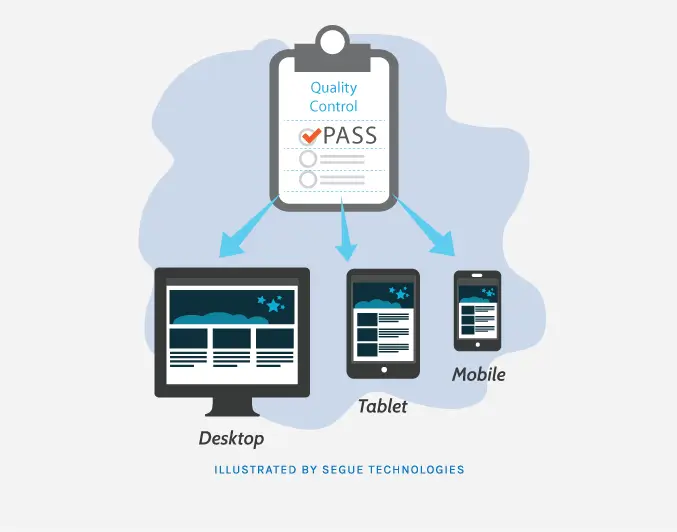
In today’s digital age, the internet has become an integral part of our lives. People are accessing websites and browsing the internet on a wide range of devices, including smartphones, tablets, laptops, and desktop computers. With such a diverse range of screen sizes and resolutions, it has become essential for web designers and developers to create websites that adapt and respond to different devices and screen sizes. This is where responsive web design comes into play.
Responsive web design is an approach to web design that aims to provide an optimal viewing experience across a variety of devices by creating flexible and adaptable layouts. It involves designing and coding a website in a way that allows it to respond and adjust its layout based on the screen size and orientation of the device being used. By adopting responsive web design principles, designers can ensure that their websites look and function well on any device, delivering a seamless user experience.
This comprehensive guide will delve into the principles, techniques, and best practices of responsive web design. Whether you are a seasoned web designer or just starting, this guide will equip you with the knowledge and skills needed to master the art of responsive web design.
Understanding the Fundamentals of Responsive Web Design:

Fluid Grids:
A fluid grid is a key component of responsive web design. It involves creating a grid system that uses relative units like percentages rather than fixed pixel values. This allows the layout to adjust and adapt to different screen sizes.
Flexible Images:
Images play a crucial role in web design. To ensure they look good on various devices, designers need to use techniques like CSS media queries and the “max-width” property to scale images proportionally and prevent them from overflowing or becoming too small.
Media Queries:
Media queries are CSS rules that apply different styles based on the characteristics of the device’s screen. By using media queries, designers can define specific CSS rules for different screen widths, orientations, resolutions, and even device capabilities.
Designing for Different Devices:

Mobile-first Approach:
With the increasing use of mobile devices, adopting a mobile-first approach has become a best practice in responsive web design. This means designing and optimizing the website layout and content for mobile devices first, and then gradually enhancing it for larger screens.
Touch-friendly Interfaces:
Responsive web design should prioritize touch-friendly interfaces for mobile and touchscreen devices. This includes using larger buttons, optimizing spacing between interactive elements, and implementing touch gestures like swipe and pinch-to-zoom.
Optimizing Performance:
Responsive websites should be optimized for performance. This involves techniques such as minimizing file sizes, leveraging caching, optimizing code, and using lazy loading for images and other assets. Performance optimization ensures fast load times and a smooth user experience across devices.
Responsive Typography:

Scaling Fonts:
Typography should adapt to different screen sizes for optimal readability. Designers can use relative units like “em” or “rem” to scale font sizes proportionally. Media queries can also be used to apply different font sizes based on screen width.
Line Length and Spacing:
Maintaining an optimal line length is crucial for readability. For responsive web design, designers need to consider the available screen width and adjust line lengths accordingly. Additionally, appropriate spacing between lines and paragraphs enhances legibility.
Using Web Fonts:
Web fonts enable consistent typography across devices, ensuring that the chosen fonts are displayed correctly. Designers should consider font file sizes and loading times while selecting web fonts.
Navigation and User Experience:
Clear and Concise Navigation:
Navigation menus should be intuitive, easy to understand, and accessible on all devices. Clear labels, hierarchical structures, and responsive design techniques can create a seamless navigation experience.
Responsive Menus:
As screen sizes change, navigation menus need to adapt. Designers can implement techniques like collapsible menus, hamburger menus, or off-canvas menus to accommodate smaller screens without sacrificing usability.
Touch Gestures:
Touchscreen devices require touch-friendly interactions. Incorporating touch gestures like swiping, tapping, and pinch-to-zoom can enhance user experience and make the website more interactive and engaging.
Testing and Optimization:
Browser and Device Compatibility:
Responsive websites should be tested on various browsers and devices to ensure consistent rendering and functionality. Cross-browser and cross-device compatibility testing is essential for a seamless user experience.
Performance Testing:
Loading times are crucial for user satisfaction and search engine rankings. Performance testing tools can help identify performance bottlenecks, optimize code, and ensure fast loading times on different devices and connections.
User Testing:
Gathering feedback from actual users can provide valuable insights into usability and user experience. User testing involves observing how users interact with the responsive website and making improvements based on their feedback.
Frameworks and Tools:
CSS Frameworks:
CSS frameworks like Bootstrap and Foundation provide pre-built responsive design components and grids. These frameworks offer a starting point for designing responsive websites and can significantly speed up development time.
CSS Preprocessors:
CSS preprocessors like Sass and Less offer enhanced capabilities and efficiency in writing CSS code. They provide features like variables, mixins, and functions, which can streamline the development process of responsive web design.
Responsive Design Tools:
There are various tools and resources available specifically for responsive web design. These tools can assist in prototyping, testing responsive layouts, and optimizing performance. Examples include responsive design testing tools, prototyping software, and browser developer tools.
Future Trends in Responsive Web Design:

Responsive Images:
With the advent of high-resolution displays, responsive images have gained importance. Technologies like the “srcset” attribute and “picture” element enable serving different image sizes based on the device’s capabilities and screen resolution.
Responsive Videos:
Video content is increasingly consumed on various devices. Responsive videos use techniques like fluid sizing, media queries, and video element attributes to adapt to different screen sizes, resolutions, and aspect ratios.
Internet of Things (IoT):
The rise of IoT devices introduces new challenges and opportunities for responsive web design. Designers need to consider how websites will be accessed and displayed on IoT devices with different screen sizes, interfaces, and capabilities.
By understanding and implementing these principles, techniques, and best practices, designers can create responsive websites that provide an optimal user experience across a wide range of devices and screen sizes. Mastering web design is essential in today’s mobile-driven world, where users expect seamless and consistent experiences across all their devices.
Conclusion:
As you embark on your journey to master responsive web design, remember that practice and experimentation are key. Stay up to date with the latest trends and technologies, and continuously refine your skills. With the increasing prevalence of mobile and diverse devices, responsive web design is no longer a luxury but a necessity. By following the principles and best practices outlined in this guide, you will be well on your way to creating beautiful and user-friendly websites that shine on any device.
Additional Resources:
For further information and resources on web design and development, visit Web Deve. Our website provides valuable insights, tutorials, and examples to help you master the art of responsive web design.


