 This guide offers tips, best practices, and strategies for creating visually appealing, user-friendly, and effective websites. It’s suitable for both seasoned web designers and beginners. This article provides valuable insights to create websites that are aesthetically pleasing and functional. In today’s digital world, web design is crucial to create a unique website that resonates with your audience and communicates your brand message effectively. Adopting the best web design principles will help ensure that your website stands out and delivers an exceptional user experience.
This web design principles teaches, such as user experience, responsive design, color theory, typography, navigation, and performance optimization. Its goal is to help beginners create modern and engaging websites that work well on different devices. The guide uses a step-by-step approach and provides tools for designing successful websites for businesses, personal blogs, or clients.
Understanding User Experience (UX)
User experience, commonly referred to as UX, is a critical aspect of web design. In simple terms, UX refers to the overall experience a user has when interacting with a website or any digital product. It encompasses every aspect of the user’s journey, from the initial landing on the website to navigating through the pages and eventually achieving their goals. A good user experience should be seamless, intuitive, easy to navigate, visually appealing, and tailored to the user’s needs.
- Importance of UX in Web Design
An engaging website is more than just attractive visual elements; it is effective in fulfilling the user’s goals. Web designers must understand the importance of UX in creating successful websites. A website with poor UX is likely to frustrate users, resulting in a high bounce rate and low conversions. On the other hand, a website with excellent UX is more likely to attract and retain users, leading to better user engagement, improved conversions, and repeat visitors.
- User-Centered Design Approach
To create a website with an optimal user experience, the design process should incorporate a user-centered approach that focuses on the users’ needs, goals, and emotions. The user-centered design process involves gathering user feedback and understanding their needs in every phase of the design process. This approach helps designers create a site that meets user needs, preferences and provides solutions to user problems. It also involves researching and analyzing user behavior, preferences, and patterns to create a site tailored to user interests.
A website can improve user experience by using clear navigation, white space, simple forms, and direct call-to-action buttons. User-focused design leads to increased traffic, lower bounce rates, and improved conversion rates. Understanding UX is crucial for creating effective and user-friendly websites. By using UX principles and a user-centered design, web designers can enhance their website’s usability, functionality, and overall user experience.
Responsive Web Design
Responsive web design is a design approach that allows websites to adapt to various screen sizes and device types, providing an optimal viewing experience for users on desktops, tablets, and smartphones. In other words, responsive web design ensures that a website’s layout, content, and functionality are optimized for all devices, providing a seamless user experience throughout.
Benefits of Responsive Web Design
The benefits of responsive web design are numerous, ranging from improved user experience to increased search engine visibility and higher conversion rates.
By implementing responsive web design, websites can achieve the following benefits:
- Improved User Experience:
Responsive web design ensures that websites provide a consistent and seamless user experience across all devices, regardless of screen size or resolution. This helps to improve user retention and engagement, as users are more likely to stay on a website that provides a user-friendly experience.
- Increased Mobile Traffic:
With the rise of mobile usage, it’s crucial that websites are accessible on all devices to capitalize on the growing mobile market. Responsive web design allows websites to be viewed on various devices and screen sizes, making them accessible to a larger audience.
- Boosted SEO:
Search engines favor responsive websites, as they provide a better user experience and reduce bounce rates. This can lead to increased search engine visibility and higher traffic, resulting in higher conversion rates.
Best Practices for Responsive Web Design

To ensure an effective and successful responsive web design, several best practices should be followed, including:
- Mobile-first design:
It’s crucial to design websites with mobile users in mind, as the majority of internet traffic comes from mobile devices. This approach helps ensure that websites are optimized for mobile devices, with simplified navigation, minimal content, and fast-loading pages.
- Flexible Grid:
Websites must have a flexible grid system that adapts to various screen sizes and device types. This helps ensure that content is legible and that the website’s design remains consistent across all devices.
- Image Optimization:
Images must be optimized for fast-loading times and high-quality resolutions. This involves using appropriate image sizes and formats that are compatible with various devices.
Responsive web design is important for websites in today’s world. It can enhance user experience, increase mobile traffic, and improve search engine visibility and conversion rates by adjusting to different devices and screen sizes. It is critical to follow best practices, including mobile-first design, flexible grids, and image optimization, to achieve successful responsive web design.
Visual Hierarchy and Layout
Visual hierarchy refers to the arrangement of visual elements in a way that communicates the importance and relevance of each element to the user. In web design, visual hierarchy is essential as it enables visitors to quickly and easily scan the website and locate the most important information. A well-executed visual hierarchy can guide the user through the website, highlighting key messages and encouraging engagement with the content.
Principles of Visual Hierarchy
There are different principles of visual hierarchy that designers can employ to create a clear and effective hierarchy of information. These include:
- Size: Larger elements tend to attract more attention than smaller elements, making them ideal for highlighting important information.
- Color: Bright colors and contrasting hues can draw attention to specific elements, creating a sense of visual weight.
- Position: Placing elements in prominent positions such as the top of the page or at the center can draw attention and indicate importance.
- Contrast: The contrasting use of elements such as font styles, colors, and shapes can create visual interest, highlighting key information.
- Repetition: Repeating specific visual elements throughout the website can create a sense of familiarity and consistency, making it easier for users to navigate the site.
Effective Layout Techniques
Layout refers to the arrangement of visual elements on a web page. An effective layout can make the website look appealing and well-structured while providing an optimal display of content. Here are some layout techniques to consider:
- Grid-based layout: A grid layout divides the page into a series of columns and rows, which can help organize content and create a consistent design.
- White space: Adequate use of white space between content blocks can provide a clearer visual hierarchy and improve readability.
- Typography: Choosing the right fonts and typography, such as clear headings and legible body text, can also improve readability and create a sense of hierarchy.
- Navigation: A clear and intuitive navigation menu can guide users through the website and help them find what they are looking for quickly.
- Responsive design: Designing websites that are optimized for different devices can ensure that the layout adapts to the screen size, providing a seamless user experience.
By implementing these principles and techniques, designers can create a visually engaging and well-structured website that effectively communicates information and facilitates user engagement.
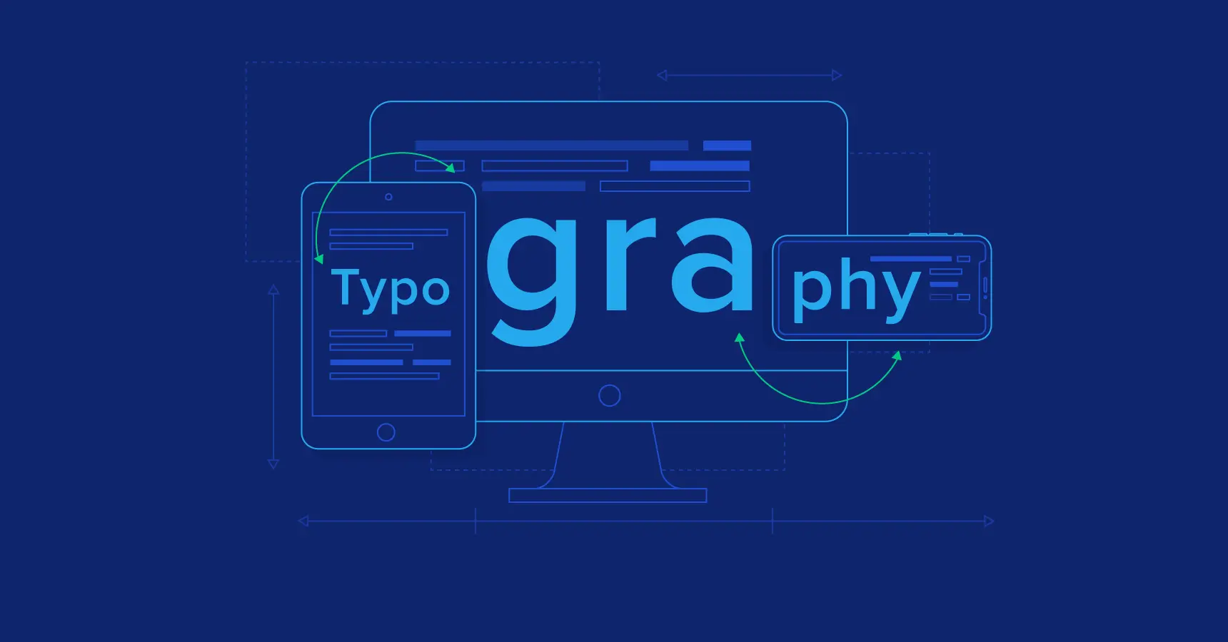
Typography and Readability
Choosing Appropriate Fonts:
When it comes to web design, typography can make or break the user experience. Choosing appropriate fonts involves finding a balance between aesthetics and readability. It’s important to consider the overall feel of the website and the target audience when selecting fonts. Sans-serif fonts, such as Arial or Helvetica, tend to be more modern and clean, while serif fonts, such as Times New Roman, are generally more traditional and classic.
Font Styling and Pairing:
Along with font selection, font styling can also impact the visual appeal and readability of the website. Bold or italicized text can be used to emphasize specific content, while different font weights can create a sense of hierarchy and contrast. It’s also essential to consider font pairing – choosing complementary fonts that work well together can enhance the overall design and readability of the website. For example, pairing a bold sans-serif font with a subtle serif font can create a balance between impact and readability.
Enhancing Readability:
Readability plays a crucial role in the effectiveness of a website’s content. To enhance readability, the designer can consider factors such as line spacing, letter spacing, and font size. Increasing line spacing, also known as leading, can improve readability by creating a sense of whitespace between lines of text. Similarly, increasing letter spacing, or kerning, can enhance legibility by providing more space between letters. Additionally, choosing an appropriate font size can ensure that users can read the text without difficulty. Too small of a font size can strain the user’s eyes, while too large of a font size can be overwhelming and disrupt the overall design.
Typography plays a crucial role in web design and should be given due attention. Appropriate font selection, styling, and readability enhancement through factors such as line spacing, letter spacing, and font size can significantly enhance the user experience and effectiveness of a website’s content. By adhering to these typography principles, designers can create contemporary websites that effectively communicate information and cater to diverse audiences.
Color Theory and Usage
Color is a crucial element in web design as it impacts the website’s overall aesthetic appeal and can influence user behavior. Understanding the psychology behind color choices can help designers create an engaging and visually pleasing website.
- Color Psychology:
Color psychology studies how colors can affect human emotions and behavior. The colors used on a website impact how users perceive the brand, the content, and the overall mood of the site. For example, warm colors such as red, orange, and yellow can evoke excitement and enthusiasm, while cool colors such as blue, green, and purple can create a sense of calm and relaxation.
- Color Schemes and Combinations:
Choosing a color scheme involves selecting a set of complementary colors that work together to create a harmonious and balanced design. There are various color schemes designers can use, such as monochrome, analogous, complementary, or triadic. It’s essential to choose colors that align with the desired emotion and message the website intends to convey. Additionally, designers can experiment with color contrasts to create visual interest and guide users toward specific elements of the website.
- Color Accessibility Considerations:
While color choices can enhance the website’s look and feel, it’s crucial to consider color accessibility for all users, including those with visual impairments. For example, designers should avoid using color as the only method to convey information, such as using red to indicate an error message. Instead, they can use additional visual cues such as text or symbols to provide context. Designers can also ensure the contrast between foreground and background colors is high enough for users with color blindness or low vision to read the text with ease.
Effective website design involves considering color psychology, selecting appropriate color schemes, and ensuring color accessibility to enhance the user experience for all visitors.
Navigation and Information Architecture
A website’s navigation design plays a crucial role in providing a seamless user experience. A clear and intuitive navigation menu helps users navigate through the website with ease, enabling them to find the information they need quickly. Navigation design involves using menus, links, and buttons to guide the user through the website’s structure.
To create an effective navigation design, designers should ensure the menu is easy to find and accessible from all pages. Including a search bar can also help users find content quickly. The menu options should be clear and straightforward, with concise labels that indicate what content can be found by clicking on them.
Effective Information Architecture:
Information architecture refers to the organization and structure of content on a website. Creating an effective information architecture is vital for ensuring users can find content quickly and easily. Information architecture involves organizing content into categories and subcategories to create a logical flow of information.
To create an effective information architecture, designers should consider the website’s purpose and target audience. They should determine what content is most important and prioritize it in the navigation menu. Creating a sitemap and wireframes can help designers visualize the website’s structure and determine how best to organize the content.
Implementing User-Friendly Menus:
User-friendly menus are key to a website’s success. The menu design should be visually appealing and easy to use, ensuring users can find the content they need without frustration.
Designers can implement user-friendly menus by using clear labels and concise descriptions. Additionally, including icons or graphics can help users quickly identify menu options. It’s also essential to consider the location of the menu, with most websites placing the menu at the top of the page or in a side navigation bar.
In conclusion, creating a clear and intuitive navigation design, effective information architecture, and user-friendly menus are critical aspects of web design principles. Implementing these principles helps to ensure users can find the information they need quickly and easily, providing an optimal user experience.
Imagery and Multimedia Integration
The use of images and graphics is important for creating an engaging website. High-quality images can differentiate a website from competitors and provide a professional appearance. It’s necessary to select relevant images for the website’s purpose and intended audience.
Web designers should also optimize images for speed and performance. Images that are too large can slow down a website’s load times, negatively affecting the user experience. Additionally, designers should consider using alternative text and descriptive captions to ensure accessibility for visually impaired users.
Incorporating Videos and Animations:
Multimedia elements such as videos and animations can enhance a website’s interactivity and engagement. Videos can serve various purposes such as displaying products, simplifying complex subjects, or featuring customer feedback. Similarly, animations can be utilized to illustrate ideas or promote branding.
It’s essential to ensure that videos and animations are relevant and enhance the user experience. They should also be optimized for web performance to ensure fast load times. When using videos and animations, designers should also consider providing alternative formats for users with slow internet connections or limitations with multimedia accessibility.
Optimizing Media for Web:
To ensure optimal website performance, designers should optimize multimedia assets for the web. This includes compressing images and videos to reduce file sizes and improve load times. Designers should also use appropriate file formats, such as JPEG or PNG, and ensure that multimedia assets are appropriately sized for their placements on the website.
Additionally, designers should consider using content delivery networks (CDNs) or other techniques to accelerate website media delivery. This helps reduce the load on web servers, improves website performance, and provides a better user experience.
By incorporating high-quality imagery and multimedia assets and optimizing them for the web, web designers can create a visually compelling and engaging website that effectively communicates the brand’s message to its audience.
Consistency and Branding

Consistency is one of the most critical principles of effective web design. A consistent design language helps users navigate the website more easily and provides a cohesive experience across all pages. To achieve consistency, designers can use a combination of design elements such as color, typography, imagery, and layout to create a unified visual language.
One way to ensure consistency is to establish design guidelines or a style guide that outlines the visual elements of the website. This guide should be shared with all designers and stakeholders to ensure that everyone is on the same page and maintains consistency across all elements.
Maintaining consistency extends beyond the visual elements of the website. Designers should also be mindful of content consistency, including messaging, voice, and tone. Consistent content helps establish brand identity and builds trust with the user.
- Importance of Branding in Web Design
Branding is another essential aspect of effective web design. A website is often the first interaction a user has with a brand, making it crucial to create a favorable impression. Through web design, designers can showcase brand identity, values, personality, and tone. By creating a unique and recognizable brand, users are more likely to remember and return to the website.
- Implementing Branding Elements
Branding elements should be incorporated throughout the website to create a cohesive and memorable experience for users. Designers can use color palettes, typography, imagery, and logos to establish branding elements that align with the brand’s identity. Branding elements should be used consistently across all pages and devices to ensure the continuity of the user experience.
Designers can utilize various elements, including messaging and tone, to strengthen brand identity beyond visual branding. Distinguishing messaging can foster a sentimental bond with the user and differentiate the brand from rivals.
Incorporating consistency and branding into web design is essential for creating an effective and engaging website. Establishing a consistent design language and implementing branding elements can result in a visually appealing and memorable website that align with the brand’s identity.
Accessibility and Inclusive Design
Web accessibility refers to the principle of designing and developing websites and digital content that can be equally accessed and used by all people, including those with disabilities. According to the World Health Organization (WHO), more than one billion people worldwide have some form of disability, and this number is expected to grow as the population ages. Therefore, creating accessible websites not only benefits users with disabilities but also enhances the overall user experience for everyone.
Designing for Inclusivity
Inclusive design is a user-centered approach to design that considers the diversity of human needs and abilities. It requires designers to consider accessibility and usability from the start of the design process, rather than retroactively adding accommodations for users with disabilities.
To create an inclusive design, designers should prioritize the following principles:
- Perceivable: Ensure that all users can perceive and understand the information presented on the website, regardless of their sensory ability.
- Operable: Create interfaces that are easy to navigate and use, regardless of users’ physical ability or input method, such as keyboard-only navigation.
- Understandable: Ensure that users can understand the information and functionality of the website, regardless of their cognitive ability or language proficiency.
- Robust: Ensure that the website’s code and content are compatible with current and future assistive technologies, such as screen readers or voice recognition software.
Accessibility Best Practices
In addition to creating an inclusive design, designers should also consider the following best practices to ensure maximum accessibility:
- Clear and consistent navigation: Use clear and consistent navigation menus and labels to help users understand the structure of the website.
- Alternative text for images: Use alternative text (alt text) to describe images, especially those that convey important information. Screen readers can read alt text aloud to users who are visually impaired.
- Color contrast: Ensure sufficient contrast between text and background colors for users with visual impairments.
- Keyboard accessibility: Ensure that all website functions can be accessed and operated using a keyboard, as some users may not be able to use a mouse.
- Video and audio transcripts: Provide transcripts or captions for videos and audio content to ensure that users with hearing impairments can access the information presented in the media.
By understanding and implementing web accessibility principles, designers can create websites that are inclusive and accessible to all users. In addition, creating an accessible website can improve SEO and overall usability, making it a win-win for both users and the website owner.
Performance Optimization
Website performance is vital to ensure a seamless user experience and prevent high bounce rates. Many visitors expect websites to load within two seconds, and if a website takes too long to load, visitors are likely to abandon it. Therefore, optimizing website performance is crucial to retain visitors and enhance brand reputation.
Techniques for Faster Loading Times
There are numerous techniques to improve website performance and accelerate loading times. These include:
- Optimizing images: Compressing image files, controlling image quality, and selecting the right format can significantly reduce the file size and loading time.
- Caching: Caching frequently accessed pages and resources can speed up website loading times by reducing server requests.
- Minimizing HTTP requests: Reducing the number of HTTP requests can significantly improve website performance by limiting data transfers.
- Minifying CSS, HTML, and JavaScript files: Removing unnecessary code from CSS, HTML, and JavaScript files reduces their file size and speeds up website loading times.
- Using a content delivery network (CDN): CDNs store website content on multiple servers worldwide, allowing visitors to access the closest server to their location, and reducing page load times.
Optimizing Page Speed
To optimize page speed, website designers should follow the following best practices:
- Reduce the size of CSS, HTML, and JavaScript files.
- Ensure that images are optimized and compressed.
- Limit the number of HTTP requests.
- Minimize render-blocking CSS and JavaScript.
- Use Gzip compression to reduce file sizes.
- Leverage browser caching with appropriate cache policies.
- Optimize server response times by monitoring and minimizing database queries and processing time.
By optimizing website performance, web designers can create websites that provide a satisfying user experience. Visitors are more likely to engage with a fast and responsive website, resulting in longer visit durations and higher conversion rates. Furthermore, optimized websites are likely to improve search engine rankings, as website loading speed is a crucial ranking factor. Therefore, Performance optimization is a crucial aspect of modern and engaging website design.
Conclusion
This guide covers essential web design principles required to develop a contemporary and captivating website. These include maximizing the use of white space, selecting a color scheme, utilizing a grid-based layout, optimizing for mobile devices and search engines, and guaranteeing quick page loading. When designing a website, it’s important to consider not only aesthetics but also functionality, accessibility, and usability. Taking into account the target audience and their needs can result in a visually attractive and user-friendly website that reaches a broader audience.
Web design is a constantly evolving field, and designers need to stay informed about the latest trends and technologies to create websites that stand out in the digital landscape. By continuously learning and experimenting with design, designers can improve their skills and develop innovative and visually appealing websites. Effective website design can enhance user engagement and facilitate business objectives. This guide outlines key web design principles that can assist in creating a visually appealing and user-friendly site.


