
Introduction
In an era dominated by digital experiences, the significance of user-friendly websites cannot be overstated. These platforms serve as the gateway to information, services, and interactions. Designing websites with users at the forefront is more than a trend; it’s a necessity. The concept of user-friendly websites revolves around creating a seamless and enjoyable online experience, where users can effortlessly navigate, engage, and achieve their goals. This article delves into the principles of user-centered web design, highlighting the importance of minimizing frustration and enhancing user satisfaction. From stunning design to a responsive layout, and everything in between, user-friendly websites are key to a positive online presence.
Understanding User-Centered Design
User-centered design is the bedrock of creating user-friendly websites. At its core, this approach revolves around empathizing with users, understanding their needs, and crafting digital experiences that align with their expectations. It’s a delicate balance between user needs and business objectives, ensuring that the website serves both parties effectively. By adopting this mindset, designers can create interfaces that are not only visually stunning but also functional and user-friendly.
The Role of User Research
User research serves as the cornerstone of user-centered design. Conducting interviews, surveys, and analyzing user behaviors provide insights into their preferences, pain points, and expectations. Building user personas helps designers visualize their target audience and tailor the website’s creative design and content to suit their needs. By actively involving users in the design project, designers can mitigate frustration by addressing user concerns directly.
Streamlining Navigation and Information Architecture
One of the key elements of user-friendly websites is streamlined navigation. Users should be able to find what they’re looking for without unnecessary clicks or confusion. Clear labels, intuitive menus, and a user-friendly layout contribute to a frustration-free experience. By implementing a well-defined information architecture, designers ensure that users can quickly locate relevant information, reducing the likelihood of frustration.
Responsive and Accessible Design
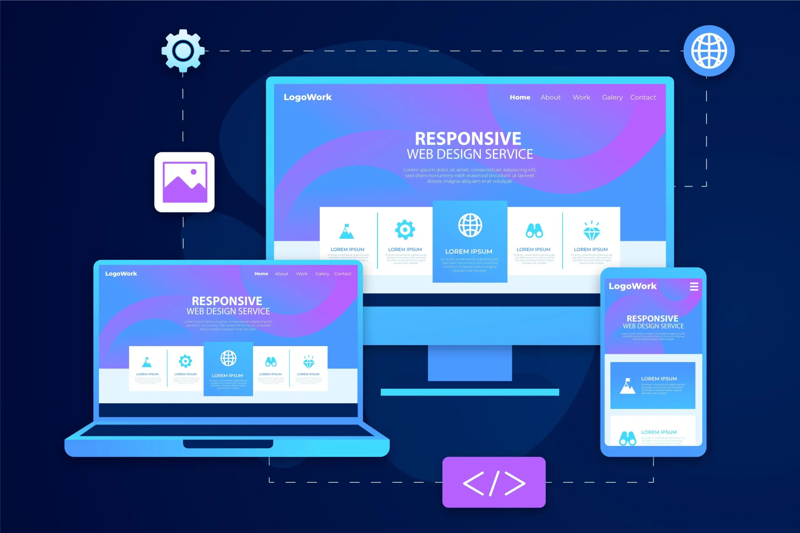
User-friendliness extends to various devices and user abilities. A responsive layout ensures that websites function seamlessly on desktops, tablets, and smartphones, catering to the diverse ways users access content. Moreover, accessibility is a fundamental aspect of user-centered design. Websites should be usable by individuals with disabilities, ensuring that everyone can navigate and interact with the content without frustration.
To delve deeper into the world of responsive web design, you can explore our comprehensive guide: Mastering the Art of Responsive Web Design. This resource offers practical techniques, examples, and insights to help you create fluid and adaptable designs that provide an optimal experience across all devices.
Visual Design for User Engagement
Visual design goes hand in hand with user-friendly websites. Consistent branding elements, such as logos and color schemes, provide a cohesive identity that resonates with users and enhances the online presence. Thoughtful use of color, typography, imagery, and white space enhances readability and engagement, making the website more inviting and user-friendly.
Speed and Performance Optimization
Page load times significantly impact user satisfaction and search engine rankings. Slow-loading websites lead to frustration and high bounce rates. Designers need to optimize images to ensure a fast loading time without compromising high-quality images. Balancing aesthetics with performance considerations is crucial for delivering a stunning design with a seamless experience that doesn’t frustrate users.
User-Centric Content Creation

User-friendly websites prioritize content that addresses user needs. Clear and concise language helps users understand the information presented. The content should be organized logically, with headings, subheadings, and bullet points aiding readability. Incorporating multimedia elements, such as images and videos, enhances engagement, making the content more appealing and user-friendly. To facilitate efficient content management, a robust content management system (CMS) can be employed. A CMS streamlines the process of creating, editing, and organizing content, ensuring that the website’s information remains up-to-date and relevant to users.
Iterative Testing and Refinement
The journey to a user-friendly website is an iterative process. Usability testing involves real users interacting with the website to identify pain points and areas of frustration. Feedback from these tests guides designers in making necessary refinements. By continuously iterating the design based on user insights, frustration is minimized, and the website evolves into a more user-friendly platform that resonates positively with potential customers.
Explore Further: Applying Website Design Principles in Practice
For a more in-depth understanding of how to apply these website design principles to your projects, you can explore my detailed guide: Step-by-Step: Applying Website Design Principles to Projects. This comprehensive resource takes you through practical steps, examples, and insights to help you create user-friendly websites that truly resonate with your audience.
Tools and Resources for User-Centered Design

Numerous tools and resources are available to aid designers in creating user-friendly websites. From wireframing and prototyping tools to analytics platforms, these resources provide valuable insights into user behavior and preferences. Staying updated on design trends through online resources and enrolling in UX design courses equips designers with the knowledge and skills needed to craft exceptional user experiences that contribute to a positive online presence.
Embracing User-Centered Design Philosophy
User-centered design is not just a process; it’s a philosophy. It requires a mindset shift that places users at the heart of design decisions. Collaboration with stakeholders, including users, ensures that the final product caters to their needs. As the design landscape evolves, embracing a user-centered approach becomes essential for staying relevant and delivering user-friendly websites that stand the test of time and contribute positively to search engines.
Conclusion
Creating user-friendly websites is an ongoing journey that demands dedication, empathy, and a commitment to minimizing frustration. By understanding user needs, streamlining navigation, optimizing performance, and embracing user-centered design principles, designers can transform websites into platforms that users not only appreciate but also enjoy using. As the digital landscape continues to evolve, prioritizing user satisfaction through user-friendly design remains a non-negotiable aspect of successful web design. With a blend of stunning design, a responsive layout, and a user-friendly approach, websites can leave a lasting impression, resonate positively with visitors, and contribute to a strong online presence.


