
Website sidebar design is paramount for optimizing user experience and enhancing functionality. As visitors navigate your website, the sidebar—central to website sidebar UI design—stands as a prime space for swift access to essential information, navigation items, and engagement. When crafted with utmost care, a website sidebar evolves into an invaluable tool for promoting your brand and catering to the specific needs of your target audience. In this comprehensive guide, we’ll delve into the art of creating a website sidebar that aligns seamlessly with your brand identity while catering to the preferences of your audience.
Understanding Your Brand Identity and Website Sidebar UI Design
Your website serves as a virtual extension of your brand. Before delving into sidebar design, take a deep dive into your brand’s identity. Define your brand’s visual elements, such as colors, typography, and icons. Consider the tone and personality you want your brand to convey. These elements will serve as the foundation for your sidebar’s aesthetics, ensuring a cohesive and consistent user experience that resonates with your brand.
Analyzing Your Target Audience
To create a website sidebar that truly resonates with users, it’s essential to understand your target audience. Define their demographics, preferences, and behaviors. Are they tech-savvy millennials, busy professionals, or senior citizens seeking information? Tailor your sidebar elements to address their needs and preferences. This might involve featuring quick links to the most relevant content, such as blog categories, product pages, or resources.
Determining Sidebar Content

Cluttered sidebars can overwhelm users, while sparse ones may fail to provide value. Clearly outline the purpose of your website sidebar. Is it for navigation, showcasing recent content, promoting special offers, or encouraging social media engagement? Prioritize essential content and features that align with your audience’s expectations and your brand’s objectives. This might include user interfaces like search functionality, recent posts, newsletter sign-up forms, or product recommendations.
Layout and Placement
Website layouts can vary significantly, influencing how your sidebar is presented. Whether it’s a fixed sidebar, floating sidebar, or collapsible one, ensure that the layout maintains a harmonious balance with other design elements. Pay special attention to responsive design, as the sidebar’s appearance may differ on desktop and mobile devices. Consistency across devices is essential for providing a seamless user experience.
Customizing Sidebar Components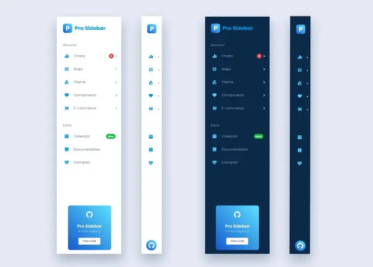
The components within your sidebar play a crucial role in functionality and engagement. Incorporate widgets that serve your audience’s needs and align with your brand’s goals. Navigation menus, drop-down menus, search bars, categories, tags, and social media links are common elements that enhance user experience. Each widget should contribute meaningfully to the overall usability of your website, making navigation intuitive and content discovery efficient.
Additionally, consider incorporating elements that educate your users about modern web design principles. Learn more to explore “Modern Web Design Principles” to discover how the latest design trends can elevate your website’s aesthetics and user experience.
Visual Consistency and Harmony
A visually consistent website sidebar contributes to the overall aesthetics and professionalism of your website. Ensure that your chosen colors, fonts, and design elements align with your brand’s identity. A harmonious design not only enhances the user experience but also communicates the trustworthiness and authenticity of your brand. Consistency in design fosters a sense of familiarity for users as they navigate your site.
Sidebar Navigation and Menu Design
Efficient sidebar navigation is a hallmark of a well-designed website. Utilize vertical navigation bars or sidebar menus to organize content logically. Incorporate dropdown menus for subcategories, creating a hierarchical structure that guides users effortlessly through your site’s offerings. A well-structured sidebar navigation system enhances user experience and ensures easy access to various sections of your website.
Dark Mode Design and Aspects of Design Brilliance
Consider offering a black mode design option for your website sidebar. Dark mode not only caters to user preferences but also adds a touch of sophistication. Implement design brilliance by utilizing canvas design techniques, parallax effects, and interactive elements within your sidebar. Striking a balance between aesthetics and functionality contributes to an immersive user experience.
Comprehensive Design in CSS and Design Principles
Leverage the power of CSS to achieve a comprehensive design for your website sidebar. Apply design principles such as contrast, alignment, proximity, and consistency to create a visually appealing and user-friendly sidebar. Pay attention to typography, spacing, and visual hierarchy to guide users’ attention effectively and enhance readability.
Testing and Iteration
Once your sidebar design is in place, it’s time to put it to the test. Conduct user testing to gauge its usability and effectiveness. Gather feedback from actual users and make iterative improvements based on their insights. User feedback can shed light on whether your sidebar design meets their expectations, is easy to navigate, and contributes to a positive overall experience.
Case Studies: Brand-Audience Alignment
Examining real-world examples can provide valuable insights into effective website sidebar UI design. Showcase websites that have successfully aligned their brand identity with audience preferences through well-designed sidebars. Highlight how these designs contribute to user engagement, efficient navigation, and the overall enhancement of the website experience.
Implementing Your Custom Sidebar Design
Implementing your custom sidebar design involves collaboration with designers or using design tools to bring your vision to life. Ensure that the design integrates seamlessly with your website’s existing layout and functionality. Test the sidebar across various devices and browsers to guarantee a consistent experience for all users.
Monitoring and Adaptation
A well-designed website sidebar is not a static element. Regularly monitor its performance using analytics tools. Track user interactions, click-through rates, and engagement metrics related to the sidebar components. Make data-driven adaptations based on user behavior to continuously enhance the sidebar’s effectiveness and user experience.
Conclusion
A carefully designed website sidebar is a powerful asset that can significantly impact user engagement and satisfaction. By aligning your brand identity with the preferences of your target audience, you create a valuable space that promotes easy navigation, quick access to information, and enhanced engagement. Remember that effective website sidebar UI design is an ongoing process that requires monitoring, adaptation, and a commitment to delivering a seamless user experience that reflects your brand’s essence.


