
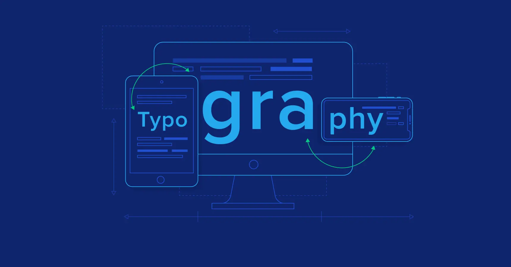
 Introduction
Typography is the art and technique of arranging a type to create a visual effect. It is an important element of web design, as it can affect a website’s readability, usability, and overall aesthetic.
The right typeface can make a website more inviting and engaging, while the wrong typeface can make it difficult to read and navigate. In this guide, we will discuss the importance of typography in web design and the factors to consider when choosing a typeface. We will also provide tips for pairing typefaces for visual harmony and using web-safe fonts and web font services.
Importance of Typography in Web Design
Typography can significantly impact the overall look and feel of a website. It can also affect the text’s readability, the website’s usability, and the user’s overall experience.
For example, a website with a clear and readable typeface will be easier to use and navigate. It will also be more inviting and engaging to visitors. On the other hand, a website with a difficult-to-read typeface will be frustrating for visitors and may make them less likely to stay on the site.
In addition to readability, typography can also be used to convey different emotions and messages. For example, a serif typeface can create a sense of formality and authority. In contrast, a sans-serif typeface can create a sense of modernity and simplicity.
Understanding Typeface Terminolog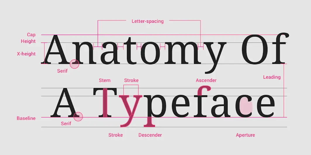
Before choosing the right typeface for your website, it is important to understand some basic typeface terminology. Here are some of the most important terms to know:
- Typeface: A typeface is a set of characters with a common design. For example, Arial and Times New Roman are both typefaces.
- Font: A font is a specific size and weight of a typeface. For example, Arial 12pt and Times New Roman 16pt are both fonts.
- Serif: A serif is a small stroke that projects from the end of a letterform. Serif typefaces are often more readable than sans-serif typefaces.
- Sans-serif: A sans-serif typeface does not have serifs. Sans-serif typefaces are often considered more modern and clean than serif typefaces.
- Weight: A typeface’s weight refers to the letters’ thickness. For example, a lightweight typeface will have thinner letters than a bold-weight typeface.
- Style: The style of a typeface refers to its overall appearance. For example, a condensed typeface will have narrower letters than an extended typeface.
Factors to Consider When Choosing a Typeface
There are many factors to consider when choosing a typeface for your website. Some of the most important factors include:
- Readability: The typeface should be easy to read, especially for long blocks of text.
- Brand identity: The typeface should complement the overall brand identity of your website.
- Target audience: The typeface should be appropriate for the target audience of your website.
- Device compatibility: The typeface should be compatible with all the devices your website visitors will likely use.
- Accessibility: The typeface should be accessible to people with disabilities.
Pairing Typefaces for Visual Harmony
Once you have chosen a typeface for your website, you must decide how to pair it with other typefaces. This is important for creating visual harmony and a cohesive design.
There are a few different ways to pair typefaces. One common approach is to use a serif typeface for headings and a sans-serif typeface for body text. This combination is often used because serif typefaces are more readable for large blocks of text, while sans-serif typefaces are more modern and clean.
Another approach is to use two different sans-serif typefaces. This can create a more contemporary and stylish look. When pairing two sans-serif typefaces, choosing typefaces with different weights or styles is important. This will help to create visual interest and avoid a monotonous design.
Web-Safe Fonts and Web Font Services:
Not all fonts are available on all devices. This is because fonts can be large files, and some devices may not have enough storage space to accommodate them.
You can use web-safe fonts or web font services to ensure that your website’s fonts are available to all visitors. Web-safe fonts are a set of fonts that are guaranteed to be available on most devices. Web font services allow you to upload your fonts to the web and then use them on your website. Our team of experienced web designers can help you choose the perfect typeface for your website.
Typography Best Practices for Web Design
Here are some typography best practices for web design:
- Use a limited number of typefaces. Using too many typefaces can make your website look cluttered and disorganized. A good rule of thumb is to use up to two or three typefaces on your website.
- Choose typefaces that are appropriate for your website’s content and target audience. For example, if your website is for a business, you should use a serif typeface for headings and a sans-serif typeface for body text. If your website is for a creative project, use more experimental typefaces.
- Use different weights and styles of the same typeface to create visual interest. For example, you could use a bold weight of a typeface for headings and a normal weight of the same typeface for body text.
- Use a consistent font size and line height throughout your website. This will help to create a sense of balance and order.
- Use white space to create a visual breathing room. Only cram a little text onto a single page. Use white space around your text to make it easier to read and scan.
- Use colour contrast to make your text stand out from the background. The text should be dark enough to read easily against a light background and light enough to read easily against a dark background.
- Test your typography choices on a variety of devices and browsers. Ensure your fonts look good and readable on all devices and browsers.
Testing and Refining Typography Choices
Once you have chosen your typefaces and applied them to your website, it is important to test your typography choices. This means viewing your website on various devices and browsers to ensure the fonts look good and readable. You should also ask a few people to test your website and provide feedback on the readability of the text.
If you receive feedback that the text is difficult to read, you may need to adjust your typography choices. This could involve changing the font size, line height, or weight. You may also need different colours or white space to make the text stand out.
The goal of testing and refining your typography choices is to create a website that is visually appealing and easy to read. By getting it right, you can ensure that your website visitors have a positive experience. Learn more about our web design services, including typeface selection.
Conclusion
Typography is an important element of web design that can affect a website’s readability, usability, and overall aesthetic. By choosing the right typefaces, pairing them effectively, and following best practices, you can create a visually appealing website that is easy to read.


