Welcome to the world of design transformation with our comprehensive guide: “Step-by-Step: Applying Website Design Principles to Projects.” In today’s digital landscape, where every click counts and every scroll shapes perception, a well-designed website emerges as the cornerstone of success. Whether you’re crafting a business platform, presenting a personal portfolio, or establishing an online hub, the systematic application of website design principles is your passport to creating captivating, user-centric experiences. Join us as we navigate through each essential phase, equipping you with the expertise needed to master the art of web design and elevate your projects to new heights.
Every successful design project starts with clearly understanding its goals and target audience. Define the purpose of your website – whether it’s to inform, sell, entertain, or connect. Identify your audience’s preferences, demographics, and behaviors to tailor the design accordingly.
Organize your content logically by creating an information architecture. Visualize the hierarchy of pages and how they will connect. Determine primary navigation menus and categories to ensure users can find information effortlessly.
Wireframes are blueprints for your website’s layout. Sketch out the basic structure of each page, focusing on the arrangement of elements, content placement, and navigation. This step provides a visual guide before diving into detailed design.
Typography greatly impacts the website’s readability and visual appeal. Choose fonts that align with your brand’s personality and are easy to read. Establish font sizes, styles for headings and body text, and maintain consistency throughout the site.

Colors evoke emotions and set the tone for your website. Develop a harmonious color palette that resonates with your brand and content. Ensure the colors complement each other and convey the desired message.
Images, illustrations, and icons enhance visual engagement. Select visuals that align with your content and resonate with your audience. Remember to optimize images for web use to maintain site performance.
A well-structured layout guides users through the content seamlessly. Utilize grid systems to create balanced designs that align elements consistently. Grids improve readability and visual coherence.
With the prevalence of various devices, responsive design is crucial. Ensure your website looks and functions seamlessly on different screen sizes. Use media queries and flexible layouts to adapt to various devices. For more insights into modern web design principles, check out “Modern Web Design Principles for Engagement”.
Whitespace, or negative space, provides breathing room for content. Embrace it to prevent visual clutter and enhance the user’s focus on essential elements. Whitespace improves readability and overall aesthetics.
Intuitive navigation is essential for a positive user experience. Design user-friendly menus and clear navigation paths. Make it easy for visitors to find what they’re looking for without frustration.
CTAs drive user interactions and conversions. Design visually distinct CTAs that stand out from other elements. Use persuasive language and strategically place them to encourage desired actions.

A fast-loading website is crucial for user satisfaction. Optimize images, minimize code, and utilize caching techniques to improve loading times. A slow website can lead to high bounce rates.
Design your website with accessibility in mind. Use semantic HTML, provide alternative text for images, and ensure resizable text options. An inclusive design accommodates all users, including those with disabilities.
Thoroughly test your website across different browsers, devices, and screen sizes. Seek feedback from colleagues, friends, or potential users. Identify and address any usability issues or design glitches.
Design is an iterative process. Continuously refine your design based on feedback and insights. Implement changes and enhancements to enhance the user experience and achieve project goals.
Integrate analytics tools to track user behavior, page views, and conversions. Analyze data to make informed design decisions. Understand what’s working and what needs improvement.
Design trends evolve, and staying updated is essential. Keep an eye on the latest design trends and technologies to ensure your website remains relevant and visually appealing.
By following these step-by-step guidelines, you’ll be equipped to apply website design principles effectively to your projects. A thoughtfully designed website not only enhances user experience but also strengthens your project’s impact and success in the digital realm. Looking to apply these principles to your project? Explore our comprehensive web design services to create stunning and user-friendly digital experiences.
To sum up, mastering the process of applying website design principles is pivotal in today’s digital era. By meticulously following the steps outlined in this guide, you’ll have the tools to craft captivating, user-centered digital experiences. From understanding project objectives to refining design elements, each phase contributes to a seamless and visually pleasing website. Keep in mind that design is an ongoing journey, shaped by user feedback and data insights. With a well-designed website, you elevate user satisfaction and elevate your project’s digital presence. Embrace these principles to create not only a user-friendly site but also a thriving digital venture.
In today’s digital age, user experience reigns supreme. Every website you visit, every online service you use, and every digital interaction you engage in is a product of web development. Behind the scenes, skilled full-stack developers work diligently to craft these digital experiences, employing a range of technical skills. And tools, technologies, and techniques to bring the virtual realm to life and ensure a seamless user journey, including the creation of responsive websites.
Web development involves the creation, design, building, and maintenance of websites and web applications. It is an essential part of the digital world, influenced by technical skills, developer expertise. And a focus on delivering high-quality websites with user-friendly navigation, mobile design, and responsive layouts.
In a world where user expectations are higher than ever, web development best practices play a pivotal role in delivering exceptional user experiences. Imagine navigating a website that takes ages to load, is visually cluttered, or lacks intuitive navigation. Such experiences frustrate users and drive them away. Best practices serve as the guidelines and standards that ensure websites are functional, user-friendly, secure. Capable of delivering optimal performance, ultimately contributing to positive user experiences and the creation of responsive websites.
This guide is tailored to two distinct audiences: beginners and experts in the field of web development, including aspiring full-stack developers. Whether you’re just starting your journey or you’re a seasoned professional, the principles outlined here will empower you to create better websites and improve your technical skills. You technical skills developer expertise, and ability to cater to potential employers’ demands for high-quality websites with user-friendly navigation, responsive design, mobile optimization, and full-stack development skills.

Embarking on your web development journey requires a clear understanding of the tools and technologies at your disposal. Frameworks, libraries, and development environments can significantly enhance your efficiency and effectiveness. Research and choose tools that align with your project’s requirements and your personal learning preferences. All while keeping the end-user experience, responsive design, and full-stack capabilities in mind.
What is web design and development? Web design and development are closely intertwined, especially in front-end development. Developing an eye for design principles such as layout, color theory, and typography will help you create visually appealing and user-friendly websites. Study existing websites, analyze their design elements, and experiment with your own designs to hone your aesthetic sense. And contribute positively to user experience, high-quality website development, responsive web design, and full-stack proficiency.
The key to mastery is consistent practice, which is especially true for back-end development. Create your own projects, tackle coding challenges, and participate in coding exercises to reinforce your technical skills, developer expertise, and full-stack capabilities. As you gain experience, you’ll become more confident in your abilities and develop a deeper understanding of how different components work together. To create a seamless user experience, making the end product more enjoyable for visitors, and ensuring the creation of responsive websites with full-stack capabilities that cater to various devices.
The web development community is a valuable resource for learning, networking, and collaboration. Join online forums, attend meetups, and engage with fellow developers on social media platforms. Sharing your experiences, asking questions, and learning from others will accelerate your growth and expose you to diverse perspectives. Ultimately enriching your ability to create user-centered websites, high-quality web development, responsive designs, and full-stack solutions that cater to the needs of modern users and potential employers.

User preferences and expectations evolve with technological advancements, a crucial consideration for both front-end and back-end development. Staying informed about the latest trends is crucial for maintaining a user-centered approach to web development. Follow tech blogs, attend conferences, and explore emerging technologies to continue expanding your knowledge and skillset. Ensuring your websites are aligned with the ever-changing needs of users, potential employers, and the demand for responsive websites and full-stack development expertise.
Version control systems, such as Git, provide a structured approach to managing code changes. By using version control, you can track modifications, collaborate seamlessly with team members, and revert to previous versions if needed. This practice enhances code organization, teamwork, and project management, contributing to a smoother development process. A more reliable end-user experience, essential aspects of high-quality website development, responsive design, full-stack solutions, and ensuring a consistent experience across various devices.
It’s crucial to conduct thorough testing to make sure your website performs as intended. This is true for both front-end and back-end development. Use a variety of testing techniques, such as user acceptability testing, integration testing, and unit testing. No matter what device visitors use to view your responsive website and full-stack applications, testing helps find and fix bugs, glitches, and compatibility issues before they negatively affect the user experience.
In today’s fast-paced digital environment, users expect websites to load quickly and deliver a smooth browsing experience, a critical element of both front-end and back-end development. Optimize your website’s performance by minimizing file sizes, leveraging browser caching, and optimizing images and videos. A well-optimized website enhances user satisfaction and encourages prolonged engagement, positively impacting the overall user experience. And contributing to high-quality website development, responsive designs, and full-stack solutions, whether you’re specializing in front-end finesse, back-end robustness, or full-stack mastery.
In the ever-evolving realm of web development, user experience remains at the forefront of innovation. By embracing best practices, beginners and experts alike can create websites that are efficient, user-friendly, secure, and innovative. As technologies continue to advance, the role of web developers, especially skilled full-stack developers, will remain crucial in shaping the digital landscape. And ensuring that users have enjoyable and meaningful interactions in the virtual world.
Looking ahead, the future of web development holds exciting possibilities for user-centric design and functionality. From immersive virtual reality experiences to seamless integration of artificial intelligence, developers will play a pivotal role in transforming the way we interact with the online world. By adhering to best practices and embracing new challenges, you’ll be well-equipped to contribute to this exciting journey of technological evolution, enriching the user experience for generations to come.
Remember, in the world of web development, the pursuit of exceptional user experiences is an ongoing journey. Where continuous learning and innovation pave the way forward for both front-end and back-end development, resulting in high-quality websites, responsive designs, full-stack solutions, and user-centered experiences that cater to the demands of users, potential employers, and the dynamic nature of the digital landscape. Intrigued by the world of web design and development? Dive deeper into this fascinating realm by exploring our Web Design and Development services, where you’ll find valuable insights, practical tips, and resources to fuel your journey in creating exceptional user experiences and mastering the art of responsive websites and full-stack development.
Web design is more than just aesthetics. It is the art and science of creating websites that are user-friendly, engaging, and functional. A good web design can make or break your online presence, as it affects how visitors perceive your brand, interact with your content, and navigate your site. In this article, we will explore eight characteristics of effective web design that can help you create websites that stand out from the crowd and achieve your goals.
In an era inundated with information and stimuli, simplicity reigns supreme. A cluttered and complex website overwhelms visitors, causing them to abandon ship within seconds. Effective web design hinges on distilling your message to its core essence and presenting it in a clean, uncluttered layout. A simple design doesn’t mean sacrificing elegance; instead, it means eliminating the unnecessary and focusing on what truly matters.
When a website embraces simplicity, users are immediately greeted with a clear understanding of its purpose. Minimalist layouts, ample white space, and a concise presentation of information ensure that visitors are not bombarded with unnecessary distractions. A clean design also facilitates faster loading times, which is crucial in retaining impatient online users. By embracing simplicity, a website invites users to engage with its content in a more meaningful way.
Consistency is the glue that holds a website together. Imagine reading a book where the font changes on every page, or watching a movie with constantly shifting color schemes—it would be disorienting. Similarly, a website that lacks visual consistency feels disjointed and unprofessional. Consistency involves using the same color palette, typography, and design elements across all pages of the website.
Consistency doesn’t stop at aesthetics; it extends to navigation as well. Users should be able to predict where they’ll find certain elements, such as the navigation menu or contact information, no matter which page they’re on. This predictability reduces friction in the user experience, allowing visitors to focus on the content and goals of the website. Through consistent design, a website gains credibility and fosters a sense of trust with its audience, making it a memorable and user-friendly destination.

In a world where people access websites on a wide range of devices, from smartphones to large desktop monitors, responsive design is no longer a luxury; it’s a necessity. A responsive website adapts seamlessly to different screen sizes and orientations, ensuring that the user experience remains consistent and enjoyable across devices.
Responsive design is not just about resizing elements—it’s about creating a fluid experience. This involves using flexible grids and layouts that automatically adjust to the screen size. Elements should rearrange themselves intelligently, ensuring that users don’t have to pinch and zoom to read text or interact with buttons. Because mobile-friendly websites are given preference by search engines like Google, a responsive website not only improves user satisfaction but also has a favourable effect on search engine rankings. For a comprehensive guide on mastering responsive and effective web design, make sure to check out our blog post: Guide to Responsive Web Design. This guide dives deep into the principles of responsive design, offering practical tips and insights to help you create websites that shine across all devices.
Web accessibility is a fundamental principle that ensures equal access and usability for all individuals, regardless of disabilities. An accessible website considers factors such as screen readers for the visually impaired, keyboard navigation for those who can’t use a mouse, and color contrast for users with visual impairments.
Implementing web accessibility isn’t just about meeting legal requirements; it’s about making your content available to the widest audience possible. By accommodating people with disabilities, you expand your potential user base and demonstrate a commitment to inclusivity. Adhering to accessibility standards like the Web Content Accessibility Guidelines (WCAG) not only enhances the user experience for everyone but also contributes to the ethical and moral responsibility of creating an inclusive digital environment.
Usability is the art of making your website user-friendly and intuitive. A website might look great, but if users struggle to find information or navigate through it, it’s ineffective. Usability involves creating clear and logical navigation menus, ensuring that important information is easily accessible, and minimizing the number of clicks required to perform essential actions.
User testing and feedback play a pivotal role in improving usability. By observing how actual users interact with your website, you can identify pain points and areas for improvement. This iterative process helps refine the user experience, making it easier for visitors to achieve their goals on your website. Whether it’s filling out a form, making a purchase, or simply finding information, a user-friendly website creates a positive impression and encourages repeat visits.
Additionally, page speed plays a pivotal role in enhancing usability. A fast-loading website not only keeps users engaged but also positively impacts search engine rankings. Slow-loading pages can lead to high bounce rates, undermining the overall user experience. To ensure your website is optimized for speed, consider implementing techniques outlined in our blog post: Mastering Page Speed Optimization. This guide provides actionable insights to help you create a website that loads swiftly and efficiently, keeping visitors engaged and satisfied.

“Content is king” is a phrase often heard in the digital realm, and for good reason. Compelling and relevant content is what keeps users engaged and coming back for more. From informative blog posts to captivating images and videos, content drives the user experience.
High-quality content resonates with your target audience, addressing their needs and interests. It should be well-organized, easy to read, and visually appealing. Utilize headings, bullet points, and concise paragraphs to make content scannable, as online users tend to skim rather than read every word. Engaging content not only retains visitors but also positions your website as a valuable resource in your industry like web design and development.
Imagine entering a room where everything is shouting for your attention—the result would be chaos. Similarly, a website without a clear visual hierarchy overwhelms visitors and makes it difficult for them to prioritize information. Visual hierarchy is the strategic arrangement of elements to guide users through your website and emphasize the most important content.
Size, color, contrast, and positioning are key factors in creating a strong visual hierarchy. The most important elements should be larger, bolder, and placed in prominent positions, while secondary elements can be smaller and less emphasized. Effective use of white space also contributes to visual hierarchy by allowing content to breathe and preventing overcrowding. By employing these techniques, a website ensures that visitors grasp the main message and take the desired actions, whether it’s signing up for a newsletter or making a purchase.
Your website is an extension of your brand identity. Consistency in branding across all touchpoints, including your website, builds trust and recognition among your audience. When visitors arrive at your website, they should immediately recognize it as an integral part of your brand ecosystem.
Branding elements, such as your logo, color palette, typography, and tone of voice, should remain consistent throughout your website. This creates a cohesive experience that reinforces your brand’s values and personality. A well-executed brand presence not only distinguishes you from competitors but also fosters a sense of loyalty among customers.
Effective web design is not a one-size-fits-all endeavor; it’s a harmonious blend of art and science. By embracing the principles of simplicity, consistency, responsiveness, accessibility, usability, quality content, visual hierarchy, and branding, you can create a website that not only looks appealing but also functions seamlessly. Remember, the online landscape is dynamic, and user expectations evolve over time. Regularly gather user feedback, analyze website analytics, and stay updated with design trends to ensure your website remains a valuable asset for your brand.
In today’s digitally-driven world, a well-designed website is not just an option—it’s a fundamental tool for reaching and engaging your target audience. As you embark on your web design journey, keep these eight characteristics in mind, and craft a digital masterpiece that leaves a lasting impression on visitors and drives your brand towards success.
In the digital age, an effective online presence has become a necessity for businesses, bloggers, educators, and individuals alike. A Content Management System (CMS) plays a pivotal role in building and maintaining a website. It empowers users to manage and publish content without needing in-depth technical knowledge. The choice of CMS can significantly impact the success of your website. This comparative guide aims to provide insights into the factors you should consider when choosing a CMS and offers a comprehensive overview of popular and niche CMS platforms.

Customization and flexibility are key factors when evaluating a CMS. This is especially important for businesses seeking tailored solutions for their Web Design and Development.
The ease of use of a CMS is paramount, especially for individuals and businesses without a strong technical background. A user-friendly interface with intuitive navigation can streamline content creation, editing, and publishing processes. Look for a CMS that offers a straightforward dashboard and a simple content editor that allows you to format text, add images, embed media, and create links without requiring HTML or coding knowledge. Additionally, features like drag-and-drop functionality for arranging elements can significantly enhance the user experience.
Every website has its unique identity and requirements. A CMS should empower you to customize the design and functionality to match your brand and objectives. The availability of a wide range of themes, templates, and plugins can make customization easier. Look for a CMS that provides not only pre-designed templates but also the flexibility to modify them according to your preferences. Furthermore, a robust CMS should allow you to extend its capabilities through plugins and integrations, enabling you to add features like e-commerce, social media integration, and more.
Website security is a critical concern in today’s digital landscape. A trustworthy CMS should prioritize security by regularly releasing updates and patches to address vulnerabilities. It’s important to choose a CMS that has a dedicated security team actively monitoring potential threats and addressing them promptly. Additionally, a good CMS should offer features like user authentication, role-based access control, and encryption to safeguard sensitive data and protect your website from malicious attacks.
As your website grows, its demands on the CMS will evolve. A scalable CMS is essential to accommodate increased traffic, content, and functionality without compromising performance. Look for a CMS that can handle higher volumes of visitors and content without significant slowdowns. It’s also beneficial if the CMS supports caching mechanisms, content delivery networks (CDNs), and other performance optimization techniques to ensure fast loading times even as your website expands.
The cost of a CMS encompasses not only its initial setup expenses but also ongoing costs for hosting, domain registration, themes, plugins, and additional services. Some CMS platforms offer free versions with limited features, while others might require subscription fees. It’s crucial to assess your budget and determine which CMS aligns with your financial constraints. Keep in mind that while free options might seem appealing, they could lack the advanced features and support you need for a professional website.
A strong user community and reliable customer support can be invaluable resources throughout your website-building journey. User communities often include forums, online groups, and tutorials where you can seek advice, share experiences, and troubleshoot issues. Additionally, a CMS with robust customer support channels, such as email, live chat, and phone support, can provide timely assistance when you encounter challenges. Prioritize CMS platforms with active communities and readily available support resources to ensure a smoother experience.

These additional insights into the factors to consider when choosing a CMS and the popular CMS platforms should provide you with a more comprehensive understanding of the landscape. Making an informed decision based on these factors can set the stage for a successful website-building journey.

Selecting the right CMS is a critical decision that influences your website’s success. The factors mentioned in this guide provide a framework for making an informed choice. Research, compare, and even experiment with different platforms to find the one that aligns with your needs and aspirations. Remember, a well-chosen CMS simplifies your online journey and enhances your website’s effectiveness.
In today’s digital age, having a strong online presence is vital for the success of any small business. A well-designed website serves as the digital storefront, representing the essence of the business to potential customers. It is the central hub where customers can learn about products or services, make purchases, and engage with the brand. In this article, we will explore the essential elements of web design for small businesses and the key steps to building a robust online presence.
Web design is not just about creating an aesthetically pleasing website; it encompasses usability, functionality, and user experience. A visually appealing website can captivate visitors, but a well-designed one will keep them engaged, encourage interaction, and ultimately convert them into customers.
Small businesses face unique challenges, such as limited resources and competition from larger enterprises. A compelling web design can level the playing field and help small businesses stand out in a crowded online marketplace. A user-friendly and responsive website establishes credibility, fosters trust, and reinforces the brand’s identity.
Before diving into web design, it’s crucial to identify the target audience. Understanding who your potential customers are, their preferences, needs, and pain points will guide the design process. Small businesses often cater to niche markets, and tailoring the website to address the specific interests of the target audience can significantly impact its success.
Conduct market research, and surveys, or analyze data from previous customers to gain insights into their preferences. This information will influence the design elements, tone, and content of the website.
Consistent branding is essential in building brand recognition and trust. Incorporate your business’s logo, colors, and fonts throughout the website. The logo should be prominently displayed on the homepage and easily accessible from any page to reinforce brand identity.
Consistency in branding extends beyond the website. Ensure that the same branding elements are used across social media platforms, marketing materials, and physical stores (if applicable). This reinforces the business’s image and creates a memorable impression on visitors.

In an era where mobile devices dominate internet usage, a mobile-responsive website is non-negotiable. A responsive design automatically adjusts the layout and content to fit various screen sizes, providing an optimal user experience across smartphones, tablets, and desktops.
Google and other search engines prioritize mobile-friendly websites in their search results, so having a mobile-responsive site can also positively impact SEO (Search Engine Optimization) rankings. It ensures that potential customers can access and navigate your website seamlessly, regardless of the device they use.
Discover the key to unlocking a seamless user experience on your website! Our in-depth guide on Responsive Web Design equips you with the knowledge and tools to create a visually stunning and user-friendly digital presence.
User-friendly navigation is crucial for guiding visitors through the website effortlessly. Complex menus, excessive clicks, or confusing layouts can lead to frustration and prompt users to abandon the site. Aim for a clear and straightforward navigation structure, ideally organized in a top or side menu, making it easy for visitors to find what they’re looking for.
Consider using descriptive labels for menu items, avoiding jargon or ambiguous language. Implement a search bar to help users quickly locate specific products or information. Additionally, include a “Call to Action” (CTA) button on each page, encouraging visitors to take the desired action, such as making a purchase or contacting the business.
Compelling content is the backbone of a successful website. High-quality, relevant content not only informs and engages visitors but also boosts SEO rankings. Create a blog section to share valuable information, industry insights, and updates, positioning your business as an authority in the field.
Remember that content should be tailored to the target audience. Use a friendly and conversational tone for a consumer-focused business, while a more formal tone may be suitable for a professional service provider.
Customer testimonials and reviews play a significant role in building trust and credibility. Positive feedback from satisfied customers can convince potential buyers that your product or service is worth considering. Feature testimonials on the homepage or dedicated testimonial pages, and showcase any awards or certifications received by the business.
Encourage customers to leave reviews on platforms like Google My Business, Yelp, or Trustpilot. Monitor and respond to reviews, showing that you value customer feedback and are committed to delivering exceptional service.
Make it easy for visitors to get in touch with your business. Include clear and visible contact information, such as a phone number and email address, on the homepage and contact page. Additionally, integrate a contact form that visitors can fill out to inquire about products, services, or any other queries.
Consider using live chat functionality, which allows customers to communicate with a representative in real time. This can greatly improve customer satisfaction and help address concerns promptly.
A strong online presence is crucial for the success of small businesses in today’s digital world. A well-designed website that caters to the target audience, features compelling content, and highlights positive customer experiences can significantly boost the business’s visibility and credibility. By investing in web design and user experience, small businesses can effectively compete with larger enterprises and pave the way for sustainable growth and success.
If you’re a small business owner in London looking to enhance your online presence, a London web design company can help. With their expertise in crafting visually appealing and user-centric websites, you can effectively compete with larger enterprises and pave the way for sustainable growth and success.
Remember that web design is not a one-time task; it requires continuous improvement and adaptation to meet changing customer needs and technological advancements. Stay up-to-date with the latest design trends and technologies to ensure your online presence remains relevant and impactful. With a strong online presence, your small business can reach new heights and thrive in the competitive digital landscape.
In today’s digital age, a strong online presence is crucial for any business or individual. One of the key elements of establishing your online identity is effective website branding. A well-branded website not only helps you stand out from the competition but also creates a memorable experience for your visitors. This article will guide you through the essential steps of branding your website, ensuring that you create a lasting and impactful online identity.
In the vast expanse of the internet, where countless websites vying for attention, having a unique and compelling brand identity is the key to standing out. Your website’s branding encompasses various elements, including visual design, voice and tone, user experience, and consistency across different channels. It goes beyond just aesthetics, influencing how your audience perceives and connects with your brand. A well-executed branding strategy ensures that your website not only captures attention but also resonates with visitors on a deeper level, leaving a lasting impression in their minds.

Building a successful website branding strategy starts with a deep understanding of your brand identity. By clearly defining your brand’s values, mission, target audience, and unique selling proposition, you can create a solid foundation for your website’s branding elements.
Here’s a more detailed breakdown of the key aspects to consider:
Identify the core principles and beliefs that define your brand. What do you stand for? What are your guiding principles? Understanding your values helps shape the overall messaging and tone of your website.
Craft a concise and compelling statement that outlines your brand’s purpose and goals. It should convey what your brand aims to achieve and the impact you want to make in your industry or niche.
Clearly define your ideal customer or target audience. Understand their demographics, interests, pain points, and aspirations. This knowledge will inform your website’s design, content, and overall brand messaging to effectively connect with and engage your target audience.
Determine what sets your brand apart from competitors. Identify your unique strengths, advantages, or features that make your brand stand out. This USP should be reflected in your website’s branding to differentiate yourself from others in your industry.
Taking the time to deeply understand your brand identity ensures that your website’s branding elements align with your overall brand messaging and effectively communicate your value proposition to your target audience. This clarity will guide you in making informed decisions throughout the branding process and create a cohesive and memorable online identity.
Visual elements play a vital role in website branding. Develop a visual identity that aligns with your brand values and resonates with your target audience.
Here are some key considerations:
Create a memorable and visually appealing logo that represents your brand’s personality and values. Ensure that it is prominently displayed on your website for instant recognition.
Choose a color scheme that reflects your brand’s tone and evokes the desired emotions. Consistency in colors across your website helps establish a cohesive and recognizable brand presence.
Select fonts that align with your brand’s personality and are easy to read. Stick to a few fonts to maintain consistency throughout your website.
Use high-quality images and graphics that complement your brand identity. Original photography or illustrations can enhance the uniqueness of your website.
Branding is not just about visuals; it also involves creating a distinct voice and tone for your brand. Determine the tone that resonates with your target audience, whether it’s friendly, professional, humorous, or authoritative. Consistently using this tone across your website’s content will help establish a memorable brand persona.

An exceptional user experience is essential for creating a memorable online identity. Consider the following UX factors:
Ensure that your website has a clear and intuitive navigation structure, allowing visitors to find information easily. Use descriptive menu labels and organize content logically.
With the increasing use of mobile devices, responsive design is crucial. Your website should adapt seamlessly to different screen sizes, providing a consistent experience for all users. Check out, If you’re interested in learning more about Responsive Web Design.
Optimize your website’s performance to minimize loading times. Slow-loading pages can drive away visitors and negatively impact your brand perception.
Guide visitors on their journey through your website by using clear and compelling call-to-action buttons. Encourage them to take desired actions, such as making a purchase or subscribing to a newsletter.
Maintain a consistent brand image across all online channels. Ensure that your website’s branding elements, such as logo, colors, and typography, are consistent with your social media profiles, email marketing, and any other digital platforms you use. Consistency reinforces your brand’s identity and helps build trust and recognition among your audience.
Engaging with your audience is a powerful way to create a memorable online identity. Incorporate interactive elements such as comment sections, social sharing buttons, and live chat features on your website. Respond promptly to comments, messages, and inquiries to foster a positive connection with your visitors.
Branding your website is a strategic process that involves understanding your brand identity, developing a compelling visual identity, establishing a unique voice and tone, optimizing user experience, maintaining consistency across channels, and engaging with your audience. By following these steps, you can create a memorable online identity that sets you apart from the competition and leaves a lasting impression on your website visitors. Remember, effective branding goes beyond just aesthetics; it encompasses every aspect of your website and the experience you provide to your audience. Invest time and effort into building a strong brand presence, and you’ll reap the rewards of increased recognition, customer loyalty, and business growth in the online realm.
 Introduction
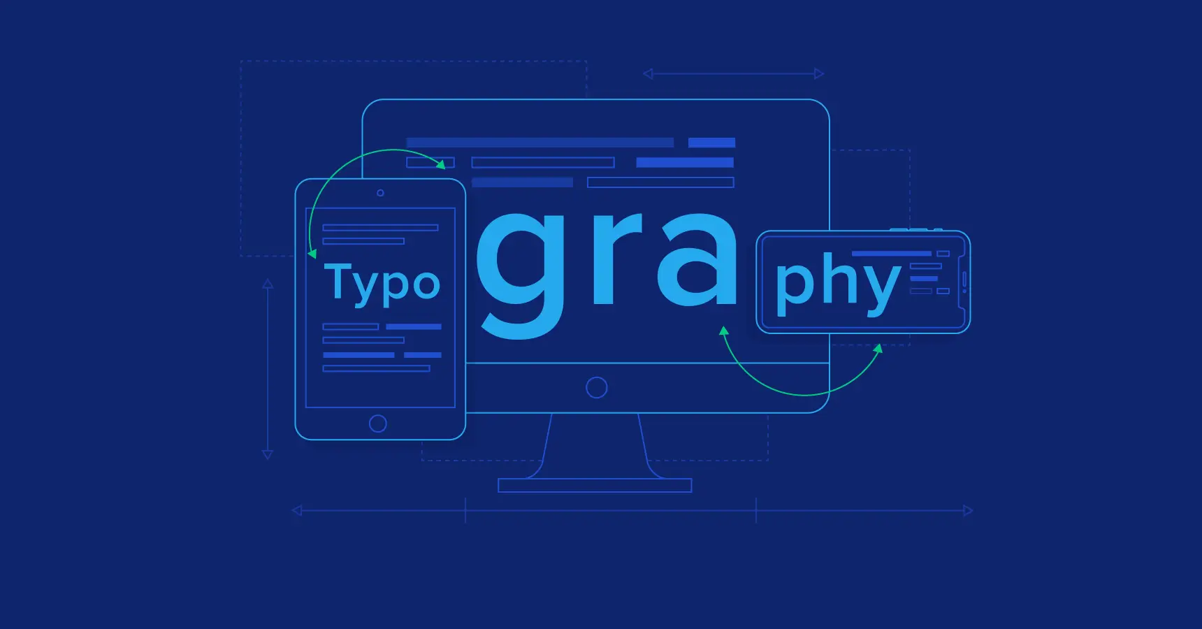
Typography is the art and technique of arranging a type to create a visual effect. It is an important element of web design, as it can affect a website’s readability, usability, and overall aesthetic.
The right typeface can make a website more inviting and engaging, while the wrong typeface can make it difficult to read and navigate. In this guide, we will discuss the importance of typography in web design and the factors to consider when choosing a typeface. We will also provide tips for pairing typefaces for visual harmony and using web-safe fonts and web font services.
Typography can significantly impact the overall look and feel of a website. It can also affect the text’s readability, the website’s usability, and the user’s overall experience.
For example, a website with a clear and readable typeface will be easier to use and navigate. It will also be more inviting and engaging to visitors. On the other hand, a website with a difficult-to-read typeface will be frustrating for visitors and may make them less likely to stay on the site.
In addition to readability, typography can also be used to convey different emotions and messages. For example, a serif typeface can create a sense of formality and authority. In contrast, a sans-serif typeface can create a sense of modernity and simplicity.
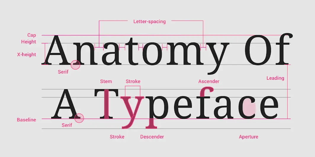
Before choosing the right typeface for your website, it is important to understand some basic typeface terminology. Here are some of the most important terms to know:
There are many factors to consider when choosing a typeface for your website. Some of the most important factors include:
Once you have chosen a typeface for your website, you must decide how to pair it with other typefaces. This is important for creating visual harmony and a cohesive design.
There are a few different ways to pair typefaces. One common approach is to use a serif typeface for headings and a sans-serif typeface for body text. This combination is often used because serif typefaces are more readable for large blocks of text, while sans-serif typefaces are more modern and clean.
Another approach is to use two different sans-serif typefaces. This can create a more contemporary and stylish look. When pairing two sans-serif typefaces, choosing typefaces with different weights or styles is important. This will help to create visual interest and avoid a monotonous design.
Not all fonts are available on all devices. This is because fonts can be large files, and some devices may not have enough storage space to accommodate them.
You can use web-safe fonts or web font services to ensure that your website’s fonts are available to all visitors. Web-safe fonts are a set of fonts that are guaranteed to be available on most devices. Web font services allow you to upload your fonts to the web and then use them on your website. Our team of experienced web designers can help you choose the perfect typeface for your website.
Here are some typography best practices for web design:
Once you have chosen your typefaces and applied them to your website, it is important to test your typography choices. This means viewing your website on various devices and browsers to ensure the fonts look good and readable. You should also ask a few people to test your website and provide feedback on the readability of the text.
If you receive feedback that the text is difficult to read, you may need to adjust your typography choices. This could involve changing the font size, line height, or weight. You may also need different colours or white space to make the text stand out.
The goal of testing and refining your typography choices is to create a website that is visually appealing and easy to read. By getting it right, you can ensure that your website visitors have a positive experience. Learn more about our web design services, including typeface selection.
Typography is an important element of web design that can affect a website’s readability, usability, and overall aesthetic. By choosing the right typefaces, pairing them effectively, and following best practices, you can create a visually appealing website that is easy to read.
 Introduction:
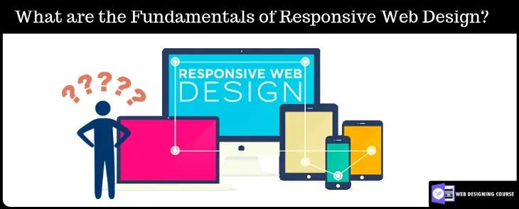
In today’s digital age, the internet has become an integral part of our lives. People are accessing websites and browsing the internet on a wide range of devices, including smartphones, tablets, laptops, and desktop computers. With such a diverse range of screen sizes and resolutions, it has become essential for web designers and developers to create websites that adapt and respond to different devices and screen sizes. This is where responsive web design comes into play.
Responsive web design is an approach to web design that aims to provide an optimal viewing experience across a variety of devices by creating flexible and adaptable layouts. It involves designing and coding a website in a way that allows it to respond and adjust its layout based on the screen size and orientation of the device being used. By adopting responsive web design principles, designers can ensure that their websites look and function well on any device, delivering a seamless user experience.
This comprehensive guide will delve into the principles, techniques, and best practices of responsive web design. Whether you are a seasoned web designer or just starting, this guide will equip you with the knowledge and skills needed to master the art of responsive web design.
A fluid grid is a key component of responsive web design. It involves creating a grid system that uses relative units like percentages rather than fixed pixel values. This allows the layout to adjust and adapt to different screen sizes.
Images play a crucial role in web design. To ensure they look good on various devices, designers need to use techniques like CSS media queries and the “max-width” property to scale images proportionally and prevent them from overflowing or becoming too small.
Media queries are CSS rules that apply different styles based on the characteristics of the device’s screen. By using media queries, designers can define specific CSS rules for different screen widths, orientations, resolutions, and even device capabilities.

With the increasing use of mobile devices, adopting a mobile-first approach has become a best practice in responsive web design. This means designing and optimizing the website layout and content for mobile devices first, and then gradually enhancing it for larger screens.
Responsive web design should prioritize touch-friendly interfaces for mobile and touchscreen devices. This includes using larger buttons, optimizing spacing between interactive elements, and implementing touch gestures like swipe and pinch-to-zoom.
Responsive websites should be optimized for performance. This involves techniques such as minimizing file sizes, leveraging caching, optimizing code, and using lazy loading for images and other assets. Performance optimization ensures fast load times and a smooth user experience across devices.

Typography should adapt to different screen sizes for optimal readability. Designers can use relative units like “em” or “rem” to scale font sizes proportionally. Media queries can also be used to apply different font sizes based on screen width.
Maintaining an optimal line length is crucial for readability. For responsive web design, designers need to consider the available screen width and adjust line lengths accordingly. Additionally, appropriate spacing between lines and paragraphs enhances legibility.
Web fonts enable consistent typography across devices, ensuring that the chosen fonts are displayed correctly. Designers should consider font file sizes and loading times while selecting web fonts.
Navigation menus should be intuitive, easy to understand, and accessible on all devices. Clear labels, hierarchical structures, and responsive design techniques can create a seamless navigation experience.
As screen sizes change, navigation menus need to adapt. Designers can implement techniques like collapsible menus, hamburger menus, or off-canvas menus to accommodate smaller screens without sacrificing usability.
Touchscreen devices require touch-friendly interactions. Incorporating touch gestures like swiping, tapping, and pinch-to-zoom can enhance user experience and make the website more interactive and engaging.
Responsive websites should be tested on various browsers and devices to ensure consistent rendering and functionality. Cross-browser and cross-device compatibility testing is essential for a seamless user experience.
Loading times are crucial for user satisfaction and search engine rankings. Performance testing tools can help identify performance bottlenecks, optimize code, and ensure fast loading times on different devices and connections.
Gathering feedback from actual users can provide valuable insights into usability and user experience. User testing involves observing how users interact with the responsive website and making improvements based on their feedback.
CSS frameworks like Bootstrap and Foundation provide pre-built responsive design components and grids. These frameworks offer a starting point for designing responsive websites and can significantly speed up development time.
CSS preprocessors like Sass and Less offer enhanced capabilities and efficiency in writing CSS code. They provide features like variables, mixins, and functions, which can streamline the development process of responsive web design.
There are various tools and resources available specifically for responsive web design. These tools can assist in prototyping, testing responsive layouts, and optimizing performance. Examples include responsive design testing tools, prototyping software, and browser developer tools.

With the advent of high-resolution displays, responsive images have gained importance. Technologies like the “srcset” attribute and “picture” element enable serving different image sizes based on the device’s capabilities and screen resolution.
Video content is increasingly consumed on various devices. Responsive videos use techniques like fluid sizing, media queries, and video element attributes to adapt to different screen sizes, resolutions, and aspect ratios.
The rise of IoT devices introduces new challenges and opportunities for responsive web design. Designers need to consider how websites will be accessed and displayed on IoT devices with different screen sizes, interfaces, and capabilities.
By understanding and implementing these principles, techniques, and best practices, designers can create responsive websites that provide an optimal user experience across a wide range of devices and screen sizes. Mastering web design is essential in today’s mobile-driven world, where users expect seamless and consistent experiences across all their devices.
As you embark on your journey to master responsive web design, remember that practice and experimentation are key. Stay up to date with the latest trends and technologies, and continuously refine your skills. With the increasing prevalence of mobile and diverse devices, responsive web design is no longer a luxury but a necessity. By following the principles and best practices outlined in this guide, you will be well on your way to creating beautiful and user-friendly websites that shine on any device.
For further information and resources on web design and development, visit Web Deve. Our website provides valuable insights, tutorials, and examples to help you master the art of responsive web design.
 This guide offers tips, best practices, and strategies for creating visually appealing, user-friendly, and effective websites. It’s suitable for both seasoned web designers and beginners. This article provides valuable insights to create websites that are aesthetically pleasing and functional. In today’s digital world, web design is crucial to create a unique website that resonates with your audience and communicates your brand message effectively. Adopting the best web design principles will help ensure that your website stands out and delivers an exceptional user experience.
This web design principles teaches, such as user experience, responsive design, color theory, typography, navigation, and performance optimization. Its goal is to help beginners create modern and engaging websites that work well on different devices. The guide uses a step-by-step approach and provides tools for designing successful websites for businesses, personal blogs, or clients.
User experience, commonly referred to as UX, is a critical aspect of web design. In simple terms, UX refers to the overall experience a user has when interacting with a website or any digital product. It encompasses every aspect of the user’s journey, from the initial landing on the website to navigating through the pages and eventually achieving their goals. A good user experience should be seamless, intuitive, easy to navigate, visually appealing, and tailored to the user’s needs.
An engaging website is more than just attractive visual elements; it is effective in fulfilling the user’s goals. Web designers must understand the importance of UX in creating successful websites. A website with poor UX is likely to frustrate users, resulting in a high bounce rate and low conversions. On the other hand, a website with excellent UX is more likely to attract and retain users, leading to better user engagement, improved conversions, and repeat visitors.
To create a website with an optimal user experience, the design process should incorporate a user-centered approach that focuses on the users’ needs, goals, and emotions. The user-centered design process involves gathering user feedback and understanding their needs in every phase of the design process. This approach helps designers create a site that meets user needs, preferences and provides solutions to user problems. It also involves researching and analyzing user behavior, preferences, and patterns to create a site tailored to user interests.
A website can improve user experience by using clear navigation, white space, simple forms, and direct call-to-action buttons. User-focused design leads to increased traffic, lower bounce rates, and improved conversion rates. Understanding UX is crucial for creating effective and user-friendly websites. By using UX principles and a user-centered design, web designers can enhance their website’s usability, functionality, and overall user experience.
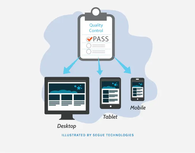
Responsive web design is a design approach that allows websites to adapt to various screen sizes and device types, providing an optimal viewing experience for users on desktops, tablets, and smartphones. In other words, responsive web design ensures that a website’s layout, content, and functionality are optimized for all devices, providing a seamless user experience throughout.
The benefits of responsive web design are numerous, ranging from improved user experience to increased search engine visibility and higher conversion rates.
By implementing responsive web design, websites can achieve the following benefits:
Responsive web design ensures that websites provide a consistent and seamless user experience across all devices, regardless of screen size or resolution. This helps to improve user retention and engagement, as users are more likely to stay on a website that provides a user-friendly experience.
With the rise of mobile usage, it’s crucial that websites are accessible on all devices to capitalize on the growing mobile market. Responsive web design allows websites to be viewed on various devices and screen sizes, making them accessible to a larger audience.
Search engines favor responsive websites, as they provide a better user experience and reduce bounce rates. This can lead to increased search engine visibility and higher traffic, resulting in higher conversion rates.

To ensure an effective and successful responsive web design, several best practices should be followed, including:
It’s crucial to design websites with mobile users in mind, as the majority of internet traffic comes from mobile devices. This approach helps ensure that websites are optimized for mobile devices, with simplified navigation, minimal content, and fast-loading pages.
Websites must have a flexible grid system that adapts to various screen sizes and device types. This helps ensure that content is legible and that the website’s design remains consistent across all devices.
Images must be optimized for fast-loading times and high-quality resolutions. This involves using appropriate image sizes and formats that are compatible with various devices.
Responsive web design is important for websites in today’s world. It can enhance user experience, increase mobile traffic, and improve search engine visibility and conversion rates by adjusting to different devices and screen sizes. It is critical to follow best practices, including mobile-first design, flexible grids, and image optimization, to achieve successful responsive web design.
Visual hierarchy refers to the arrangement of visual elements in a way that communicates the importance and relevance of each element to the user. In web design, visual hierarchy is essential as it enables visitors to quickly and easily scan the website and locate the most important information. A well-executed visual hierarchy can guide the user through the website, highlighting key messages and encouraging engagement with the content.
There are different principles of visual hierarchy that designers can employ to create a clear and effective hierarchy of information. These include:
Layout refers to the arrangement of visual elements on a web page. An effective layout can make the website look appealing and well-structured while providing an optimal display of content. Here are some layout techniques to consider:
By implementing these principles and techniques, designers can create a visually engaging and well-structured website that effectively communicates information and facilitates user engagement.

When it comes to web design, typography can make or break the user experience. Choosing appropriate fonts involves finding a balance between aesthetics and readability. It’s important to consider the overall feel of the website and the target audience when selecting fonts. Sans-serif fonts, such as Arial or Helvetica, tend to be more modern and clean, while serif fonts, such as Times New Roman, are generally more traditional and classic.
Along with font selection, font styling can also impact the visual appeal and readability of the website. Bold or italicized text can be used to emphasize specific content, while different font weights can create a sense of hierarchy and contrast. It’s also essential to consider font pairing – choosing complementary fonts that work well together can enhance the overall design and readability of the website. For example, pairing a bold sans-serif font with a subtle serif font can create a balance between impact and readability.
Readability plays a crucial role in the effectiveness of a website’s content. To enhance readability, the designer can consider factors such as line spacing, letter spacing, and font size. Increasing line spacing, also known as leading, can improve readability by creating a sense of whitespace between lines of text. Similarly, increasing letter spacing, or kerning, can enhance legibility by providing more space between letters. Additionally, choosing an appropriate font size can ensure that users can read the text without difficulty. Too small of a font size can strain the user’s eyes, while too large of a font size can be overwhelming and disrupt the overall design.
Typography plays a crucial role in web design and should be given due attention. Appropriate font selection, styling, and readability enhancement through factors such as line spacing, letter spacing, and font size can significantly enhance the user experience and effectiveness of a website’s content. By adhering to these typography principles, designers can create contemporary websites that effectively communicate information and cater to diverse audiences.
Color is a crucial element in web design as it impacts the website’s overall aesthetic appeal and can influence user behavior. Understanding the psychology behind color choices can help designers create an engaging and visually pleasing website.
Color psychology studies how colors can affect human emotions and behavior. The colors used on a website impact how users perceive the brand, the content, and the overall mood of the site. For example, warm colors such as red, orange, and yellow can evoke excitement and enthusiasm, while cool colors such as blue, green, and purple can create a sense of calm and relaxation.
Choosing a color scheme involves selecting a set of complementary colors that work together to create a harmonious and balanced design. There are various color schemes designers can use, such as monochrome, analogous, complementary, or triadic. It’s essential to choose colors that align with the desired emotion and message the website intends to convey. Additionally, designers can experiment with color contrasts to create visual interest and guide users toward specific elements of the website.
While color choices can enhance the website’s look and feel, it’s crucial to consider color accessibility for all users, including those with visual impairments. For example, designers should avoid using color as the only method to convey information, such as using red to indicate an error message. Instead, they can use additional visual cues such as text or symbols to provide context. Designers can also ensure the contrast between foreground and background colors is high enough for users with color blindness or low vision to read the text with ease.
Effective website design involves considering color psychology, selecting appropriate color schemes, and ensuring color accessibility to enhance the user experience for all visitors.
A website’s navigation design plays a crucial role in providing a seamless user experience. A clear and intuitive navigation menu helps users navigate through the website with ease, enabling them to find the information they need quickly. Navigation design involves using menus, links, and buttons to guide the user through the website’s structure.
To create an effective navigation design, designers should ensure the menu is easy to find and accessible from all pages. Including a search bar can also help users find content quickly. The menu options should be clear and straightforward, with concise labels that indicate what content can be found by clicking on them.
Information architecture refers to the organization and structure of content on a website. Creating an effective information architecture is vital for ensuring users can find content quickly and easily. Information architecture involves organizing content into categories and subcategories to create a logical flow of information.
To create an effective information architecture, designers should consider the website’s purpose and target audience. They should determine what content is most important and prioritize it in the navigation menu. Creating a sitemap and wireframes can help designers visualize the website’s structure and determine how best to organize the content.
User-friendly menus are key to a website’s success. The menu design should be visually appealing and easy to use, ensuring users can find the content they need without frustration.
Designers can implement user-friendly menus by using clear labels and concise descriptions. Additionally, including icons or graphics can help users quickly identify menu options. It’s also essential to consider the location of the menu, with most websites placing the menu at the top of the page or in a side navigation bar.
In conclusion, creating a clear and intuitive navigation design, effective information architecture, and user-friendly menus are critical aspects of web design principles. Implementing these principles helps to ensure users can find the information they need quickly and easily, providing an optimal user experience.
The use of images and graphics is important for creating an engaging website. High-quality images can differentiate a website from competitors and provide a professional appearance. It’s necessary to select relevant images for the website’s purpose and intended audience.
Web designers should also optimize images for speed and performance. Images that are too large can slow down a website’s load times, negatively affecting the user experience. Additionally, designers should consider using alternative text and descriptive captions to ensure accessibility for visually impaired users.
Multimedia elements such as videos and animations can enhance a website’s interactivity and engagement. Videos can serve various purposes such as displaying products, simplifying complex subjects, or featuring customer feedback. Similarly, animations can be utilized to illustrate ideas or promote branding.
It’s essential to ensure that videos and animations are relevant and enhance the user experience. They should also be optimized for web performance to ensure fast load times. When using videos and animations, designers should also consider providing alternative formats for users with slow internet connections or limitations with multimedia accessibility.
To ensure optimal website performance, designers should optimize multimedia assets for the web. This includes compressing images and videos to reduce file sizes and improve load times. Designers should also use appropriate file formats, such as JPEG or PNG, and ensure that multimedia assets are appropriately sized for their placements on the website.
Additionally, designers should consider using content delivery networks (CDNs) or other techniques to accelerate website media delivery. This helps reduce the load on web servers, improves website performance, and provides a better user experience.
By incorporating high-quality imagery and multimedia assets and optimizing them for the web, web designers can create a visually compelling and engaging website that effectively communicates the brand’s message to its audience.

Consistency is one of the most critical principles of effective web design. A consistent design language helps users navigate the website more easily and provides a cohesive experience across all pages. To achieve consistency, designers can use a combination of design elements such as color, typography, imagery, and layout to create a unified visual language.
One way to ensure consistency is to establish design guidelines or a style guide that outlines the visual elements of the website. This guide should be shared with all designers and stakeholders to ensure that everyone is on the same page and maintains consistency across all elements.
Maintaining consistency extends beyond the visual elements of the website. Designers should also be mindful of content consistency, including messaging, voice, and tone. Consistent content helps establish brand identity and builds trust with the user.
Branding is another essential aspect of effective web design. A website is often the first interaction a user has with a brand, making it crucial to create a favorable impression. Through web design, designers can showcase brand identity, values, personality, and tone. By creating a unique and recognizable brand, users are more likely to remember and return to the website.
Branding elements should be incorporated throughout the website to create a cohesive and memorable experience for users. Designers can use color palettes, typography, imagery, and logos to establish branding elements that align with the brand’s identity. Branding elements should be used consistently across all pages and devices to ensure the continuity of the user experience.
Designers can utilize various elements, including messaging and tone, to strengthen brand identity beyond visual branding. Distinguishing messaging can foster a sentimental bond with the user and differentiate the brand from rivals.
Incorporating consistency and branding into web design is essential for creating an effective and engaging website. Establishing a consistent design language and implementing branding elements can result in a visually appealing and memorable website that align with the brand’s identity.
Web accessibility refers to the principle of designing and developing websites and digital content that can be equally accessed and used by all people, including those with disabilities. According to the World Health Organization (WHO), more than one billion people worldwide have some form of disability, and this number is expected to grow as the population ages. Therefore, creating accessible websites not only benefits users with disabilities but also enhances the overall user experience for everyone.
Inclusive design is a user-centered approach to design that considers the diversity of human needs and abilities. It requires designers to consider accessibility and usability from the start of the design process, rather than retroactively adding accommodations for users with disabilities.
To create an inclusive design, designers should prioritize the following principles:
In addition to creating an inclusive design, designers should also consider the following best practices to ensure maximum accessibility:
By understanding and implementing web accessibility principles, designers can create websites that are inclusive and accessible to all users. In addition, creating an accessible website can improve SEO and overall usability, making it a win-win for both users and the website owner.
Website performance is vital to ensure a seamless user experience and prevent high bounce rates. Many visitors expect websites to load within two seconds, and if a website takes too long to load, visitors are likely to abandon it. Therefore, optimizing website performance is crucial to retain visitors and enhance brand reputation.
There are numerous techniques to improve website performance and accelerate loading times. These include:
To optimize page speed, website designers should follow the following best practices:
By optimizing website performance, web designers can create websites that provide a satisfying user experience. Visitors are more likely to engage with a fast and responsive website, resulting in longer visit durations and higher conversion rates. Furthermore, optimized websites are likely to improve search engine rankings, as website loading speed is a crucial ranking factor. Therefore, Performance optimization is a crucial aspect of modern and engaging website design.
This guide covers essential web design principles required to develop a contemporary and captivating website. These include maximizing the use of white space, selecting a color scheme, utilizing a grid-based layout, optimizing for mobile devices and search engines, and guaranteeing quick page loading. When designing a website, it’s important to consider not only aesthetics but also functionality, accessibility, and usability. Taking into account the target audience and their needs can result in a visually attractive and user-friendly website that reaches a broader audience.
Web design is a constantly evolving field, and designers need to stay informed about the latest trends and technologies to create websites that stand out in the digital landscape. By continuously learning and experimenting with design, designers can improve their skills and develop innovative and visually appealing websites. Effective website design can enhance user engagement and facilitate business objectives. This guide outlines key web design principles that can assist in creating a visually appealing and user-friendly site.
If you’re interested in becoming a modern developer, then full-stack development is a must-have skillset. Full-stack developers, often referred to as software engineers, are in high demand because they have the ability to work on both front-end development and back-end development of web applications. In this article, we’ll provide you with a comprehensive guide to full-stack development. We’ll cover everything from understanding full-stack development to building your first application, advanced topics, testing, and deployment, and more. By the end of this guide, you’ll have a solid understanding of full-stack development and be well on your way to becoming a modern developer.
Full-stack development refers to the process of building web applications that include both front-end development and back-end development layers. A full-stack developer is someone who has the skills to work on all three layers: the front-end, the back-end, and the database. The front-end layer is responsible for the user interface and user experience of the application, emphasizing user interactions. The back-end layer is responsible for the server-side logic and communication with the database, which often involves managing database queries. The database layer is responsible for storing and retrieving data using database management systems, including relational databases.
Becoming a full-stack developer requires mastering the art of both front-end and back-end development. Dive into the world of HTML, CSS, and JavaScript, and unlock the secrets to creating stunning websites and applications. Some of the popular back-end development technologies include Node.js, Ruby on Rails, and Django. Additionally, you’ll need to have a good understanding of databases such as MySQL and MongoDB. If you are new to full-stack development, consider exploring the beginner’s guide for full-stack development which offers basic knowledge and skills to build web applications from scratch using modern technologies and tools.

To become a successful full-stack developer, there are several key skills that you’ll need to master. These include:
HTML is the foundation of any web application and is essential in front-end development for structuring web pages. CSS is used to style and layout web elements, making them visually appealing in front-end web development.
JavaScript is a programming language that’s used to add interactivity to your web pages, a critical skill for front-end developers. You’ll need to have a deep understanding of JavaScript syntax and how to use it to manipulate the Document Object Model (DOM). Explore how JavaScript plays a vital role in today’s web development. It allows developers to create interactive and user-friendly interfaces, while also connecting the front-end and back-end parts of a website
In back-end development, you’ll need to know how to write server-side code. This includes languages such as Node.js, Ruby on Rails, and Django.
In the context of relational databases, you’ll need to know how to work with databases such as MySQL. For NoSQL databases like MongoDB, understanding how to create collections, insert data, and perform complex database queries is essential.

A simple to-do list application is a great starting point for aspiring full-stack developers. It helps them apply essential skills, from setting up the environment to creating a user-friendly front-end and robust back-end with database integration. Even experienced professionals find value in building such applications as a refresher or to explore new technologies. The to-do list project remains versatile and educational for all levels of experience in full-stack development. Here’s an overview of the steps involved:
Before you can start building your full-stack application, you’ll need to set up your development environment. This involves installing the necessary software and tools. In the case of full-stack development, you’ll typically need to install Node.js, a popular JavaScript runtime, which will allow you to run JavaScript on the server side. Additionally, you’ll need to install MongoDB, a NoSQL database that is commonly used in full-stack development.
In front-end web development, the user interface and user experience are paramount. To create the front-end, you’ll use a combination of HTML, CSS, and JavaScript. HTML provides the structure of your web pages, CSS is used to style and layout the elements on the page, and JavaScript adds interactivity and dynamic functionality. For your to-do list application, you can start by creating a simple user interface with input fields for adding tasks and a list to display the tasks. Utilizing front-end frameworks can enhance your development skills and streamline the process.
The back-end of your application handles the server-side logic and communication with the database. In full-stack development, you have a variety of options for the back-end, including Node.js, Ruby on Rails, Python with Django, and more. For simplicity, let’s use Node.js as an example. With Node.js, you can use frameworks like Express.js to handle routing and create APIs for your front-end to interact with. You’ll write server-side code to handle requests from the front-end, such as adding and deleting tasks from the to-do list.
To store and retrieve data for your application, you’ll need to connect to a database. In this case, we’ll use MongoDB, a popular NoSQL database. With MongoDB, you can store your tasks as documents in collections. You’ll need to set up a connection to your MongoDB database and write code to perform CRUD (Create, Read, Update, Delete) operations on the tasks collection, showcasing your database management skills.
Testing is an essential part of the development process to ensure that your application works as expected. In full-stack development, you can use different types of testing, including unit testing to test individual components or functions in isolation and integration testing to verify how different components of your application work together. By writing comprehensive tests, you can catch bugs and ensure that your application functions properly, demonstrating your commitment to development skills.
Once you’ve built your first full-stack application, it’s time to dive into more advanced topics to further expand your range of skills. Some of these topics include:
Microservices are a way of breaking down large applications into smaller, more manageable services, a strategy often employed by full-stack web developers.
Containerization, facilitated by tools like Docker, is a way of packaging your application into containers, making it easier to deploy and manage, showcasing your grasp of full-stack web development.
As your application grows, you’ll need to ensure that it’s scalable to handle increased traffic and data. This includes using techniques such as load balancing and horizontal scaling, demonstrating your proficiency in development skills.

Testing and deployment are crucial aspects of full-stack development. You’ll need to ensure that your application works as expected and that it’s deployed correctly. Some tips for testing and deployment include:
Implementing rigorous unit testing ensures that individual components of your application work as expected, while integration testing ensures that all components work together as expected, a testament to your commitment to development skills.
Leveraging cloud platforms such as AWS and Azure simplifies the deployment and management of your applications, showcasing your understanding of modern deployment practices.
CI/CD is a way of automating the testing and deployment process, which saves time and reduces errors, reflecting your adoption of efficient development workflows.
In conclusion, full-stack development is an essential skill set for modern developers, including full-stack web developers. By understanding front-end development and back-end development, mastering essential development skills, building your first application, exploring advanced topics, and learning about testing and deployment, you’ll be well on your way to becoming a successful full-stack developer or software engineer. At Web Deve London, we’re committed to helping developers learn new skills and stay up-to-date with the latest technologies.