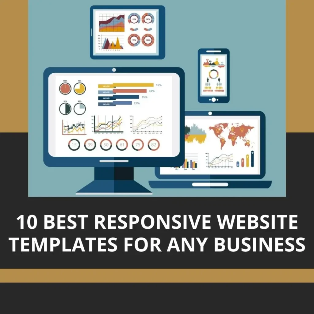
Modern web design now demands the use of responsive website templates. Being able to adjust your website to different screen sizes and resolutions is essential because more and more people are using mobile devices to access the internet. A pre-designed layout that adapts to fit the screen of any device is known as a responsive website template. The advantages of adopting responsive website templates will be discussed in this post, along with the top 10 templates that may be used by any type of company.
What are Responsive Website Templates?
A web design strategy called responsive design seeks to offer the best viewing experience possible on a variety of devices. A pre-built design that is responsively optimized is known as a responsive website template. Instead of needing to develop unique versions of websites for each device, it enables web designers to create websites that can adjust to various screen sizes and resolutions.
Responsive website templates leverage modern technologies and intuitive interfaces to provide a flawless user experience. They often come with custom plugins and a range of features that make it easy to create a visually appealing and functional website. With the responsive layout provided by these templates, your website will look beautiful on any device. For those who are unfamiliar with responsive websites, there is a guide available on responsive web design that provides a comprehensive explanation of how it works and its importance in modern web design. By checking out this guide, you can gain a better understanding of responsive websites and their benefits.
Selection Criteria for the Top Responsive Website Templates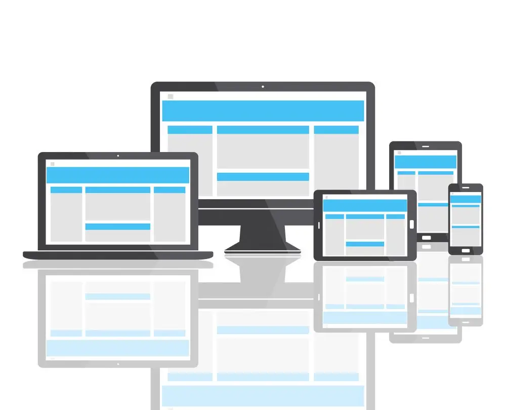
When selecting a responsive website template, it’s important to consider various factors to ensure it meets your business needs. Here are some essential criteria to keep in mind:
Modern Layouts and Clean Designs
Look for templates with these features. A visually appealing website will make a positive impression on visitors.
Mobile-friendly Website Template
Select a template that is mobile-friendly to ensure that users on mobile devices have a seamless experience. This ensures that your website works and looks fantastic on tablets and smartphones.
Range of Features
Consider templates with a variety of features, such as contact forms, drop-down menus, and custom plugins. These features improve your website’s usability and user experience.
Customization Options
Pick a template that offers customization options so you can personalize your website and make it consistent with your brand identity. Look for opportunities to alter the typefaces, layouts, and color palette.
Additional Features
Some templates may include advanced features like split-screen sliders or interactive elements. These can give your website a distinctive flair and set it apart from the competition.
Top 10 Responsive Website Templates for Any Type of Business
-
Divi by Elegant Themes
Divi is a flexible and adaptable template with modern designs, an intuitive interface, custom plugins, and a range of features. It offers a user-friendly drag-and-drop builder, making it easy to create unique designs.
-
Avada by ThemeFusion
Avada is a versatile template renowned for its straightforward aesthetic and wide-ranging customizability possibilities. It features a responsive design and is compatible with many modern technologies.
-
BeTheme by Muffin Group
There is a fully adjustable template with a variety of pre-built color schemes and layouts. It has various features suitable for various businesses and offers a responsive design.
-
Bridge by Qode Interactive
Bridge is an innovative website template with beautiful graphics and cutting-edge functionality. It supports modern technologies like parallax scrolling and offers a responsive layout.
-
X by Themeco
X is a flexible template that includes numerous distinctive designs known as “stacks.” Its adaptable design and range of customization possibilities make it suitable for various enterprises.
-
Jupiter by Artbees
Jupiter is a versatile template renowned for its simple aesthetic and wide-ranging customizability possibilities. It offers a responsive design and works with cutting-edge programs like CSS3 animations.
-
Porto by Okler Themes
Porto is a business website template with modern designs, clean layouts, and a range of features. Due to its adaptable layout and support for individual plugins, it can be used in various sectors.
-
TheGem by CodexThemes
TheGem is a flexible template with cutting-edge functionality and contemporary designs. It has an adaptable design and supports modern features like video backgrounds and smooth scrolling.
-
Salient by ThemeNectar
Salient is a robust template with many features, beautiful designs, and cutting-edge functionality. Modern technologies like parallax effects are supported, and it offers a responsive layout.
-
Uncode by Undsgn
Uncode is a creative website template known for its simple aesthetic and open-ended customization possibilities. It provides a responsive design and works with modern programs like CSS3 transitions.
Choosing the best responsive website template is crucial for developing a visually appealing and mobile-friendly website, to sum up. When choosing the ideal template for your company, take into account elements like contemporary styles, customization choices, range of functionality, and more sophisticated capabilities. Using these responsive themes can help you ensure that your website offers the best user experience possible across all devices, bringing in more visitors and enhancing your online visibility.


